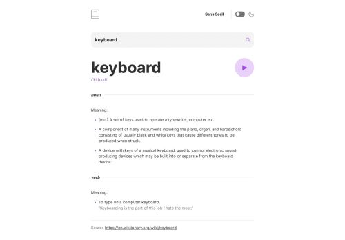
Dictionary App with SolidJS and TailwindCSS

Solution retrospective
During the process of building this dictionary web app challenge using Solid JS and Tailwind CSS, I had the opportunity to explore and implement various features that enhance user experience and interactivity. It was an exciting journey, and I'd like to share some key points and best practices I encountered during development.
Component-Driven Development: One of the crucial aspects of this project was organizing the codebase in a modular and reusable way. Solid JS's component-based architecture allowed me to break down the user interface into smaller components, making it easier to manage and maintain the code. Tailwind CSS's utility classes further complemented this approach by providing a highly expressive and efficient way to style components.
Responsive Design: Ensuring a seamless experience across different devices and screen sizes was a priority. Leveraging Tailwind CSS's responsive classes, I created a layout that adapts gracefully to various screen dimensions. Media queries and utility classes were used strategically to achieve this responsiveness without compromising on code readability.
Form Validation: Implementing the form validation message for blank form submissions involved careful handling of user input. Solid JS's reactivity made it effortless to validate the form data and display appropriate feedback to users. This practice contributes to a user-friendly and error-free form submission process.
Integration with External API: Integrating the Free Dictionary API was a crucial step in fetching word definitions and audio files. I ensured that the app gracefully handles API responses and displays relevant information to users. Robust error handling and proper loading indicators contribute to a polished user experience.
Dynamic Theming: Enabling users to switch between light and dark themes offered a personalized touch to the app. Tailwind CSS's dark mode variant allowed me to create a smooth transition between themes, making the user interface visually appealing and accessible in different lighting conditions.
Font Switching: Allowing users to switch between serif, sans-serif, and monospace fonts was achieved through dynamic class bindings in Solid JS. This functionality offers users a sense of control over their reading experience, contributing to a more inclusive design.
Prefers-Color-Scheme: As a bonus feature, I implemented the correct color scheme based on users' computer preferences using the prefers-color-scheme media query in CSS. This subtle touch enhances accessibility and demonstrates attention to detail in the design.
Overall, the combination of Solid JS and Tailwind CSS proved to be a powerful and efficient toolset for building this web app challenge. Leveraging Solid JS's reactivity and Tailwind CSS's utility-first approach, I achieved a high level of interactivity, responsiveness, and modularity in the codebase.
As I continue to refine the project, I would greatly appreciate any feedback from the community on specific areas such as the form validation process, responsive design across various devices, and suggestions for further optimizing the codebase with Tailwind CSS's best practices.
Thank you for taking the time to review my progress, and I look forward to valuable insights and learning opportunities from the community's feedback. Together, we can make this dictionary web app a seamless and delightful experience for all users!
Please log in to post a comment
Log in with GitHubCommunity feedback
No feedback yet. Be the first to give feedback on Junior Nascimento's solution.
Join our Discord community
Join thousands of Frontend Mentor community members taking the challenges, sharing resources, helping each other, and chatting about all things front-end!
Join our Discord