Display, Border, Border-shadow, Radius, etc.

Solution retrospective
Check my solution. I'm still learning bases of front-end I would love to hear some advices :))
Please log in to post a comment
Log in with GitHubCommunity feedback
- @DrKlonk
Hi Luka, nice to see you on the platform!
Some (unordered) things that stick out to me:
The centering doesn't really work on smaller screens, as Simone pointed out. Use margin auto, flexbox or grid for this to keep it nice and responsive.
It seems like the responsive.css is the same as style.css. No need to repeat everything in a media query, just the things that are changing.
The border radius of the card seems a bit off, I think it can be just one value.
Using rem instead of px is usually preferred, because it increases responsiveness and thereby accessibility.
Naming classes is hard, but can definitely be improved here. Try to come up with something that describes the content of the element. "Annual-plan" is a decent name in that sense, "div-button" is not. You might want to call that "button-group". Also "rand-text" suggests the text to be random, which it is not.
Naming things is super important, even more so when collaborating with others.
The annual-plan class can be centered more cleanly by removing
max-widthandleftproperties and introducingmargin: 0 2remor something similarMarked as helpful - @Madmanden
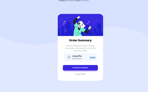
Great work Luka! The padding on the card is a bit off though it seems.
- @lukakavtarra
Report shows me 3 accessibility issues ... can someone explain how to solve them?


Join our Discord community
Join thousands of Frontend Mentor community members taking the challenges, sharing resources, helping each other, and chatting about all things front-end!
Join our Discord