Skip to content
  • Unlock Pro
  • Log in with GitHub
Solution
Submitted about 2 years ago

display flex

LuccaMauroMolina•130
@LuccaMauroMolina
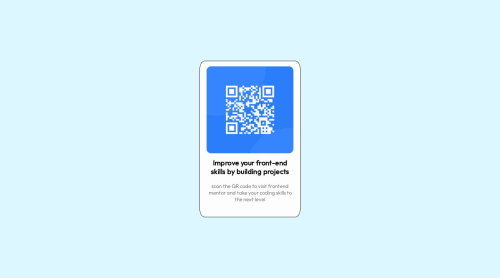
A solution to the QR code component challenge
View live sitePreview (opens in new tab)View codeCode (opens in new tab)

Solution retrospective


que podria mejorar en este proyecto? que otras cosas podria agregar o usar?

Code
Select a file

Please log in to post a comment

Log in with GitHub

Community feedback

  • Ryan Martin•240
    @rmartin93
    Posted about 2 years ago

    I would focus on simplifying the html and css. You shouldn't need as many p tags as you have, and you're making a lot of things display flex when a text-align center would be just fine.

    Example html simplification

    <div class="marco">
    <div class="card">
    <div class="card-image">
    <img src="./images/image-qr-code.png" alt="QR">
    </div>
    <div class="card-body">
    <h2 class="oscuro">Improve your front-end skills by building projects</h2>
    <p class="frontend">scan the QR code to visit frontend mentor and take your coding skills to the next level</p>
    </div>
    </div>
    </div>
    

    From there, it shouldn't take much CSS to make the h2 and p tag look how you want. I would try just using text-align and play with that a bit.

    Happy coding!

    Marked as helpful
  • Grace•32,130
    @grace-snow
    Posted almost 2 years ago

    Hi, sorry it's taken a while for me to get to this.

    I think you need to refactor this solution, changing quite a lot of HTML and CSS to get it much closer to the design. This would not pass in a work environment as it is at the moment.

    1. Yes simplify the HTML, but go further than the suggested above. This is ONE component, with an img, heading and paragraph inside. That's really it. You don't need all those extra divs or paragraphs.
    2. Always use a main landmark on every page or component demo you ever build. In this case the marco div can become a main.
    3. Use the background colour provided in the style guide
    4. This component does not have a border in the design, it has a subtle box shadow
    5. The component must not have a width or height. It should have a max-width only and this should be defined in rem, not px
    6. The component should have some padding. The image should not have margin, except optionally a margin-bottom.
    7. The img should not have a width. You should always include a modern CSS reset at the very start of styles. One of many things this would do is set img to display: block; max-width: 100%. That - and border-radius - is all the styling that this img needs
    8. Border-radius should always be a fixed value, not percentage. Using % will result in really strange distorted radii on non-square elements
    9. The image needs a proper alt description. It should say what the image shows and where this code goes. Like "QR code to FrontEndMentor.io"
    10. The image does not need a wrapping div, nor does the text content in the card. And neither would need display grid or flex. Don't add complication for no reason
    11. The HTML you choose is extremely important for communicating what this content is. Read my post on choosing HTML elements for more on this. It's invalid to have all the paragraphs as you are doing at the moment. As said previously, this is just an image, heading and paragraph
    12. Font size and letter-spacing must never be in pixels. This is extremely important, and your sites will be inaccessible if you don't follow this recommendation

    Good luck. I'll look at this again once you've refactored it, but won't leave comments on other solutions until then

  • Ryan Martin•240
    @rmartin93
    Posted about 2 years ago

    The text should wrap naturally based on the width of the container.

  • LuccaMauroMolina•130
    @LuccaMauroMolina
    Posted about 2 years ago

    para no poner tantas etiquetas p como puse antes, como hago para acomodar bien los textos como en el design

Join our Discord community

Join thousands of Frontend Mentor community members taking the challenges, sharing resources, helping each other, and chatting about all things front-end!

Join our Discord

Stay up to datewith new challenges, featured solutions, selected articles, and our latest news

Frontend Mentor

  • Unlock Pro
  • Contact us
  • FAQs
  • Become a partner

Explore

  • Learning paths
  • Challenges
  • Solutions
  • Articles

Community

  • Discord
  • Guidelines

For companies

  • Hire developers
  • Train developers
© Frontend Mentor 2019 - 2025
  • Terms
  • Cookie Policy
  • Privacy Policy
  • License

Oops! 😬

You need to be logged in before you can do that.

Log in with GitHub

Oops! 😬

You need to be logged in before you can do that.

Log in with GitHub

How does the accessibility report work?

When a solution is submitted, we use axe-core to run an automated audit of your code.

This picks out common accessibility issues like not using semantic HTML and not having proper heading hierarchies, among others.

This automated audit is fairly surface level, so we encourage to you review the project and code in more detail with accessibility best practices in mind.

How does the CSS report work?

When a solution is submitted, we use stylelint to run an automated check on the CSS code.

We've added some of our own linting rules based on recommended best practices. These rules are prefixed with frontend-mentor/ which you'll see at the top of each issue in the report.

The report will audit all CSS, SCSS and Less files in your repository.

How does the HTML validation report work?

When a solution is submitted, we use html-validate to run an automated check on the HTML code.

The report picks out common HTML issues such as not using headings within section elements and incorrect nesting of elements, among others.

Note that the report can pick up “invalid” attributes, which some frameworks automatically add to the HTML. These attributes are crucial for how the frameworks function, although they’re technically not valid HTML. As such, some projects can show up with many HTML validation errors, which are benign and are a necessary part of the framework.

How does the JavaScript validation report work?

When a solution is submitted, we use eslint to run an automated check on the JavaScript code.

The report picks out common JavaScript issues such as not using semicolons and using var instead of let or const, among others.

The report will audit all JS and JSX files in your repository. We currently do not support Typescript or other frontend frameworks.

Oops! 😬

You need to be logged in before you can do that.

Log in with GitHub

Frontend Mentor for Teams

Frontend Mentor for Teams helps companies and schools onboard and train developers through project-based learning. Our industry-standard projects give developers hands-on experience tackling real coding problems, helping them master their craft.

If you work in a company or are a student in a coding school, feel free to share Frontend Mentor for Teams with your manager or instructor, as they may use it to help with your coding education.

Learn more

Oops! 😬

You need to be logged in before you can do that.

Log in with GitHub

Oops! 😬

You need to be logged in before you can do that.

Log in with GitHub

Oops! 😬

You need to be logged in before you can do that.

Log in with GitHub