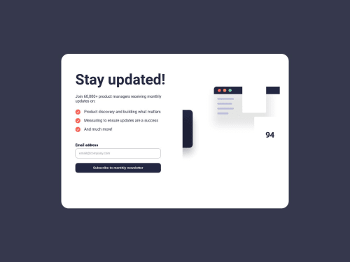
Submitted almost 2 years agoA solution to the Newsletter sign-up form with success message challenge
display flex, media screen, html, css , js functions, dom manipulation
accessibility

@UlviAsov
Solution retrospective
I had no difficulty writing the project. There were some problems while creating the mobile design, but I tried to solve the problems as best as I could.
Code
Loading...
Please log in to post a comment
Log in with GitHubCommunity feedback
No feedback yet. Be the first to give feedback on Ülvi Abbaslı's solution.
Join our Discord community
Join thousands of Frontend Mentor community members taking the challenges, sharing resources, helping each other, and chatting about all things front-end!
Join our Discord