


@vanzasetia
Posted
Hi, Mukhiddin Nosirov! 👋
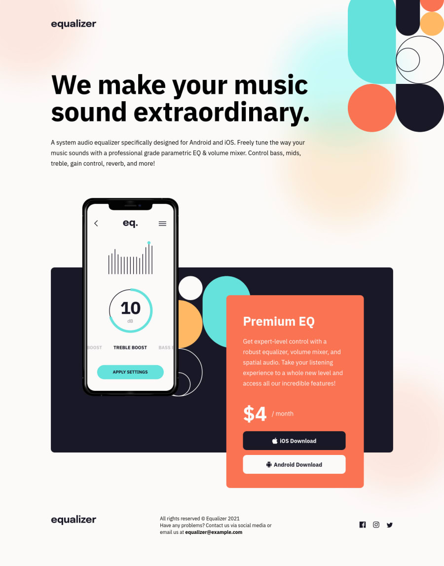
I recommend making all the background patterns as either background images or showing them with pseudo-elements. This way, the HTML does not contain a lot of decorative images, especially when they are just background images.
You should add alternative text to the logo. Logo is an important content of the page. It is not decorative, and not the one with blank alternative text (alt=""). Without that information, a screen reader user or a search engine will not know what the site/project is called.
For the download buttons, you should use <a> elements with download attribute instead of <button> elements.
Replace the second <h1>—with "Premium EQ" text content—with <h2>. There should not be more than one h1 on a page. Many <h1> elements mean many titles which can confuse the users, especially the screen reader users.
The Instagram link in the footer does not have alternative text. Also, the href value for it is "instagram".
Never use px unit for font sizes. Use rem or em instead. Relative units such as rem and em can adapt when the users change the browser's font size setting. Learn more — Why you should never use px to set font-size in CSS
I recommend using a unitless value for the line-height. Also, make it the <body> styling. Learn more — line-height - CSS: Cascading Style Sheets | MDN
If there is more than one word for the font family name, you should wrap it with a quote. So, you should write "ibm plex sans" instead ibm plex sans.
In this case, there should be only either min-width or max-width media queries instead of having both at the same time. If you write your CSS with the mobile-first approach then you should only use min-width media queries to overwrite mobile styling. Keep your CSS as simple as possible.
I hope you find this useful. Happy coding! 😄
Marked as helpful
@Pepeleeno
Posted
@vanzasetia Thank you for the comment :)
"I recommend making all the background patterns as either background images or showing them with pseudo-elements."
Can you please elaborate on "Pseudo-elements", I just don't understand.
"Never use px unit for font sizes. Use rem or em instead. Relative units such as rem and em can adapt when the users change the browser's font size setting."
I read the article that you provided me and I still don't understand one thing. I am completing the projects on this web site using fimga files. For example if in figma project the size of the h1 is defined as 40px, then how can I style h1 using rem/em units ?
@vanzasetia
Posted
@Pepeleeno
You are welcome! 👍
Can you please elaborate on "Pseudo-elements", I just don't understand.
Sure! Pseudo-elements that I was talking about are elements that are created through CSS using ::after and ::before.
::after - CSS: Cascading Style Sheets | MDN
::before - CSS: Cascading Style Sheets | MDN
You can see the complete list of different pseudo-elements at MDN page.
Pseudo-classes - CSS: Cascading Style Sheets | MDN
[...] in figma project the size of the h1 is defined as 40px, then how can I style h1 using rem/em units ?
Figma defines the text font size in pixel units—I was a PRO member so I know about it. So, I recommend converting those pixel units to rem units by dividing the pixel value by 16.
The formula: [pixel value] / 16 = [rem value]
For example, if the font size of the <h1> is 40, then 40 / 16 = 2.5. As a result, you will write 2.5rem for the value.
It might seem complicated at first. But, as you get used to it, you will naturally calculate the pixel value inside your head.
Also, you don't need to be very specific like writing 1.2485rem. I would recommend just writing it as 1.2rem or 1.25rem instead.
The last thing, beware of the "62.5% trick". It can only make you calculate rem value easily because 1rem is equal to 10px. But, using that trick will cause more issues.
Learn more about it — Should I change the default HTML font-size to 62.5%?
Sorry for the long answer. I hope this helps. 🙂
Marked as helpful
