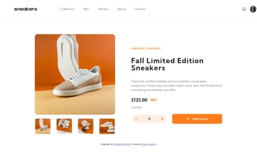
Submitted over 3 years agoA solution to the E-commerce product page challenge
E Commerce Product Page Using Sass and jQuery
jquery, sass/scss

@Luke-Fernando
Solution retrospective
Any feedbacks are welcome!
Code
Please log in to post a comment
Log in with GitHubCommunity feedback
- @fraserwat
Hey, this is looking great!
Few things I'd change:
- Look into only needing a single <nav> component, and switching between it being a hamburger menu and an always-visible header menu depending on your media query. Here's a walkthrough https://dev.to/devggaurav/let-s-build-a-responsive-navbar-and-hamburger-menu-using-html-css-and-javascript-4gci
- Instead of using
heightandwidthattributes, usemax-widthon your top-level container, and let everything else fill the screen responsively. Might need to play around with padding and margins a bit, but it will give you more flexibility, and you'll be able to build more responsive web pages. - The above will also make it easier to have more consistent design margins - e.g. the left and right edges of the heading don't line up with the left and right edges of your <main> component.
Aside from that, great stuff - keep it up!!
Fraser
Marked as helpful

Join our Discord community
Join thousands of Frontend Mentor community members taking the challenges, sharing resources, helping each other, and chatting about all things front-end!
Join our Discord