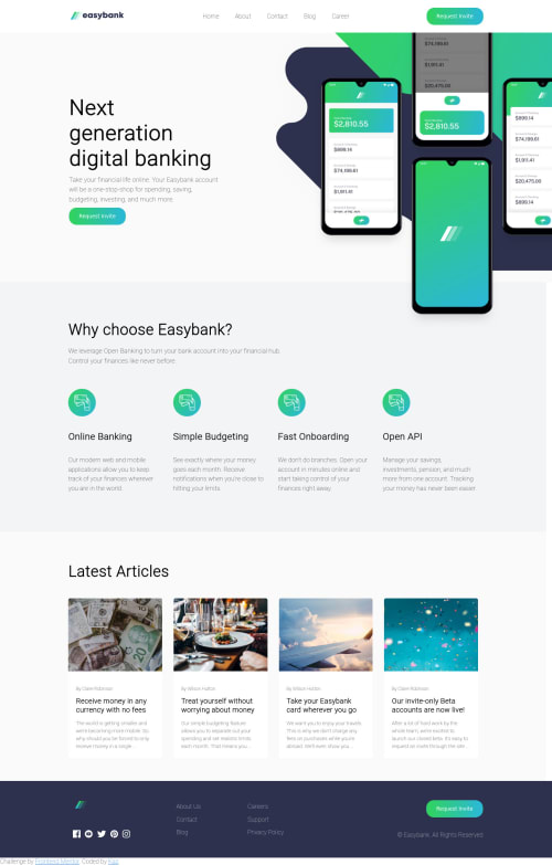
Easy Bank Landing page with CSS grid and flexbox

Solution retrospective
My CSS is disorderly, please comment on how I can make it more readable. I know I can reduce the amount of css I write by adding styles that would apply to multiple elements, but not exactly sure which styles to group together.
Also any help on how to change the color of an svg via image tag or better yet, how to use an actual svg tag would be nice. (If you notice the svg of the logo in the bottom left is unreadable and the svgs of the sns icons do not change when hovered on).
Cheers!
Please log in to post a comment
Log in with GitHubCommunity feedback
- @FluffyKas
Heyo,
This design is in the Intermediate section for a reason. I know because I solved it recently and I struggled with it big time ^^ I'd not recommend using this one as your first challenge. If I were you, I'd go back to some easier challenges and learn by doing them because you seem to be missing some core concepts. Those challenges may not be as pretty as this one but you'd learn a lot by doing them! But since you started this one already, I do my best to be helpful.
-
The mobile view is missing completely but I'm sure you're aware of this. When you're doing a website, you should always start by doing the mobile view first and then change things around for tablet and desktop view with media queries. This way you'll need to change less code than the other way around.
-
Look up relative units, like em, rem, etc. Don't use px at all, unless you're setting a border or box-shadow, where it doesn't matter as much. Px is very bad for accessibility. When you're using them, you're hardcoding values that cannot be changed by the user even if they wish to do so (some people will want to change font-size in their browsers for example, simply because they can't see the content well enough if it's too small).
-
Look up custom properties in CSS! They'll make your life easier when you're setting colors (among other things, but for colors it's definitely a life-changer, when you're starting out with CSS). A smaller, easier challenge would be a good way to practice them!
-
Use the font family, given in the design :) It just looks better, since it was probably chosen by a person who knows a bit more about web design than us ^^
-
Look up more semantic HTML elements, for example:
header,section,article,ul,br,footer,a, etc. When using a div, think twice whether it's truly needed or if you could perhaps replace it with something more semantic. -
Some of your images missing alt texts. All images must have an alt, even if it's left empty. More on this topic here. This is truly the ultimate guide.
-
Svg images: they're super tricky to use. If you'd like to change their color, you need to use what is called an inline svg (so you need to insert the whole super long svg code right in your html). It's ugly, but this way you get access to their "path" which sets their color. There's a lot more to this and I'm by no means an expert on the topic, yet. :( There's also some accessibility concerns to be aware of when using inline svgs so I'd do some research on that as well! If you're a beginner, for the icons I'd use Font Awesome. They're a lot easier to handle, especially when you need to change their color or size.
-
Disorderly CSS: I wouldn't worry too much about being orderly for now! You can certainly do some refactoring later but that can go wrong very easily. You gave pretty much everything a class which I think is a great start, a lot better than just using element selectors. Don't worry too much about having a lot of CSS rules, for now it's better to have too many than too few and making a mistake of grouping things together that don't really belong together. You'll get a feel for this later, as you practice.
I could go into more detail on your solution, but as I said, I've got the feeling that you're missing some core concepts that would be useful to look at! If you don't know Kevin Powell, check out his channel, he has a bunch of great videos on all the topics mentioned above and a lot more. Correct markup, relative units, positioning, css selectors, everything. He's a great teacher, so I recommend following him.
So again, I'd recommend doing some smaller challenges first perhaps and revisiting this one later, when you know a bit more!
Marked as helpful -

Join our Discord community
Join thousands of Frontend Mentor community members taking the challenges, sharing resources, helping each other, and chatting about all things front-end!
Join our Discord