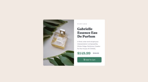
Not Found
Not Found
Not Found
Not Found
Not Found
Not Found
Not Found
Not Found
Not Found
Not Found
Not Found
Not Found
Not Found
Not Found
Not Found
Not Found
Not Found
Not Found
Not Found
Not Found

Submitted

Easy Peasy Lemon Squeezy

P

@nnorthway

Desktop design screenshot for the Product preview card component coding challenge

This is a solution for...

  • HTML
  • CSS
1newbie
View challenge

Design comparison


SolutionDesign

Solution retrospective


The strict pixel sizes always get me. how did you get the image to scale?

Community feedback

@GrzywN

Posted

Great job on the challenge @nnorthway!

You can achieve responsive images by using width: 100% and max-width: 350px for example. Or just with a one line and new CSS function width: min(350px, 100%). Sometimes you can use vw units instead of percentages or with calc() to take paddings/margins into account: width: min(calc(100vw - 2rem), 350px). There is also another way with new aspect-ratio: calc(width / height) property and width: 100%; height: auto;.

Also always make sure to wrap the main content into <main> tag to solve accessibility issues.

Hope this helps! Have a nice day and keep coding !

1

P

@nnorthway

Posted

@GrzywN the main tag! Forgot that. I think aspect-ratio would have been the answer here for sure. Thanks for the suggestions!

0

Please log in to post a comment

Log in with GitHub
Discord logo

Join our Discord community

Join thousands of Frontend Mentor community members taking the challenges, sharing resources, helping each other, and chatting about all things front-end!

Join our Discord