


@shashilo
Posted
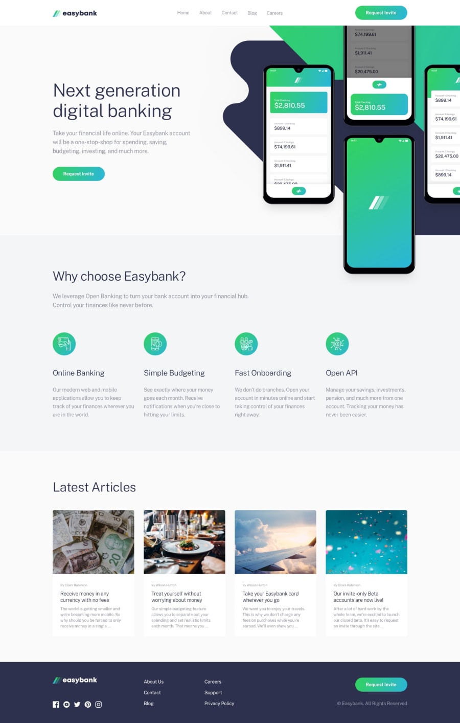
Really good job on this Marko. The mobile implementation is pretty darn spot on! I can tell it took a lot of tweaking with the backgrounds the way you were doing it. I usually try to set the background image to the container and position it to the corner or side where the designer intended. Using background-position will hurt you when you have to make the site look great on multiple screen sizes.
Some areas of improvement that I could see:
-
Raising up your level of detail. Right away, I could tell that the hero copy was off a little. Then when you look at the
Why choose Easybank?section, the grid sub heading and grid content spacing and is off from the design. Yes. These are nit picky things, but raising your ability to see this level of detail will make you a better developer. -
You have 2 navigation DOM elements. One for desktop and one for mobile. This is not ideal as it's not semantic and you have to maintain both navs. There are many solutions on Codepen that shows you how to use just 1 nav for desktop and mobile.
@MarkoNikolajevic
Posted
@shashilo thank you for all suggestions and feedbacks! Specially for the one about the nav, I usually use 2 of them, one for mobile and one for larger screens and hide/show them.
