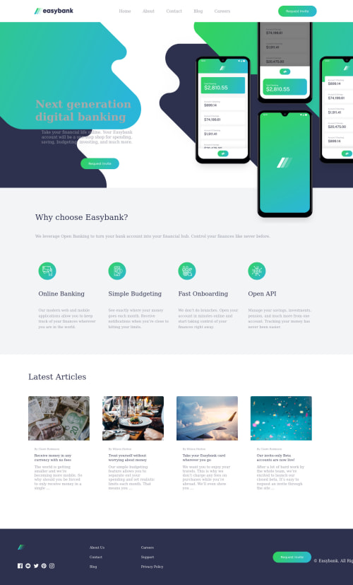
Submitted over 3 years agoA solution to the Digital bank landing page challenge
Easybank landing page & YouTube Video

@DrMESAZIM
Solution retrospective
Hi Developers . I put in some great effort to deliver the solution as well as YouTube video on this link
https://www.youtube.com/watch?v=ueB18pDu_n0&list=PLJdBgzM3s56nEj4bSk81PmgD6cZVFAnV5
Please assist me where I can improve especially on the footer button which is slightly half visible
Code
Loading...
Please log in to post a comment
Log in with GitHubCommunity feedback
No feedback yet. Be the first to give feedback on IRVINE MESA's solution.
Join our Discord community
Join thousands of Frontend Mentor community members taking the challenges, sharing resources, helping each other, and chatting about all things front-end!
Join our Discord