Submitted about 4 years agoA solution to the Digital bank landing page challenge
Easybank landing page challenge hub

@luis08201
Solution retrospective
Hi everyone.
This is my second attempt at this challenge.
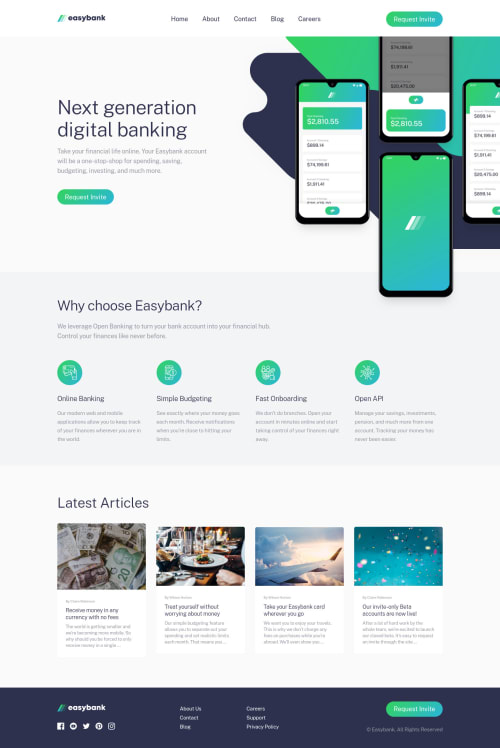
When I did this project for the first time I was struggling positioning the main image, so I decided to build this page mobile-first. It was not too complicated than the first time.
I would love to hear any feedback about my second attempt.
Happy Coding :D.
Code
Loading...
Please log in to post a comment
Log in with GitHubCommunity feedback
No feedback yet. Be the first to give feedback on Luis's solution.
Join our Discord community
Join thousands of Frontend Mentor community members taking the challenges, sharing resources, helping each other, and chatting about all things front-end!
Join our Discord