Not Found
Not Found
Not Found
Not Found
Not Found
Not Found
Not Found
Not Found
Not Found
Not Found
Not Found
Not Found
Not Found
Not Found
Not Found
Not Found
Not Found
Not Found
Not Found
Not Found

Submitted

EasyBank responsive website using bootstrap5 and scss

#bootstrap#sass/scss#jquery

@AbdulkerimAwad

Desktop design screenshot for the Easybank landing page coding challenge

This is a solution for...

  • HTML
  • CSS
  • JS
3intermediate
View challenge

Design comparison


SolutionDesign

Solution retrospective


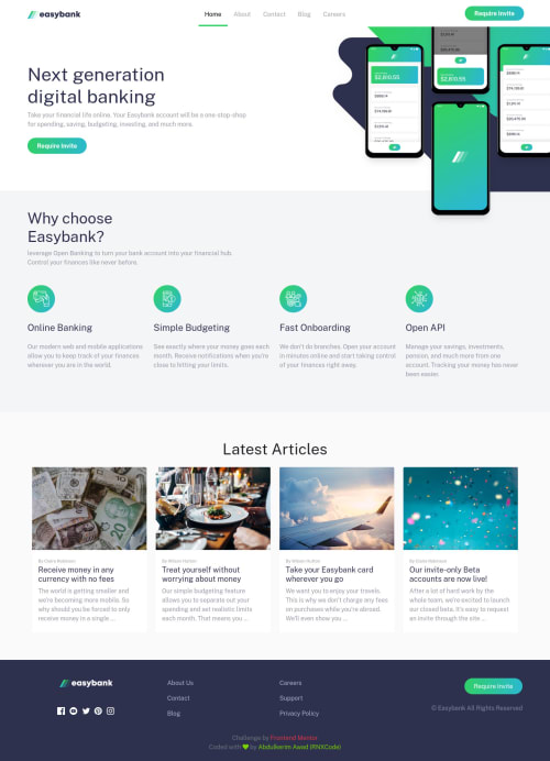
The header part was the hardest because I was confused about putting it in the container or not and using the positioning or not, whatever was a great challenge.

Community feedback

Mo 840

@MohamedAridah

Posted

Hello @AbdulkerimAwad, Yo did good job for this challenge🎉👍. Your website is Responsive and that's really cool.

However i have some notes for you:

  • Don't use compiled css files for learning purpose projects. it will be impossible to read your code form style.css file.

  • css nesting rules are so long. and this will make browser take time to render it. example for what i mean:

    html body .main-container header .next-generation button

it could be shortened to

    .main-container header .next-generation button
  • try use transition property specially for .next-generation button and footer links.

  • change .card-title color property of the articles on hover

I hope this wasn't too long for you, hoping also it was useful😍.

Goodbye and have a nice day.

Keep coding🚀

Marked as helpful

1

@AbdulkerimAwad

Posted

@MohamedAridah I have made the appropriate modifications. You can see them if you like. Thank you very much for your opinions and suggestions

1
Mo 840

@MohamedAridah

Posted

@AbdulkerimAwad Good job. if you like you can see My solution for this challenge it may be useful for you. I'm also advising you to start with simple challenges I myself did that it will be very useful for you when starting work with big challenges.

wish you good luck with the next project👍🌹

Marked as helpful

1

@AmodeusR

Posted

It seems you got bipolar with the mobile menu, it opens from top to bottom and suddenly it becomes a box xD And a tip I could give you is to give a smaller max-width to the "reasons you should choose Easybank" section, the text of the items there get too wide at about 400px screen width.

Besides that? Oof, I can't imagine how hard it were to make this challenge, I already got fearsome just by imagining the media queries (⊙_⊙;) Great job 👌

Marked as helpful

1

@AbdulkerimAwad

Posted

@AmodeusR I have made the appropriate modifications. You can see them if you like. Thank you very much for your opinions and suggestions

1

Please log in to post a comment

Log in with GitHub
Discord logo

Join our Discord community

Join thousands of Frontend Mentor community members taking the challenges, sharing resources, helping each other, and chatting about all things front-end!

Join our Discord