Not Found
Not Found
Not Found
Request path contains unescaped characters
Not Found
Not Found
Not Found
Not Found
Not Found
Not Found
Not Found
Not Found
Not Found
Not Found
Not Found
Not Found
Not Found
Not Found
Not Found
Not Found

Submitted

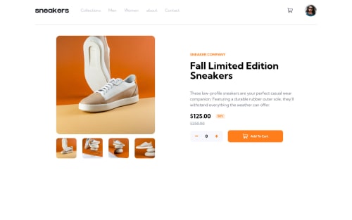
e-commerce product page

Bachar_elkarni• 160

@Diamo-B

Desktop design screenshot for the E-commerce product page coding challenge

This is a solution for...

  • HTML
  • CSS
  • JS
3intermediate
View challenge

Design comparison


SolutionDesign

Solution retrospective


This is the first project that made me feel actually cornered like hell, can someone pls gimme some pieces of advice especially in the responsivity part of the CSS code? I'll really appreciate it. Happy Coding :D

Community feedback

Miran Legin• 620

@miranlegin

Posted

Hi Bachar,

first of all congratulations on completing this challenge!

At first everything seems to be working fine but if you scratch the surface a bit you will find some things that can be improved. Let's get started!

  1. when you click the + sign multiple times you will notice that the button is slightly changing position left/right. this is because every number has different width so the whole thing is slightly shifting from left to right. let's assume that nobody is going to put more than 99 sneakers in the basket to our safe bet is to limit the width of the number container to 2 characters. in css that would be 2ch. more info on ch units also as this is not monospaced font more info on monospaced fonts we can be safe and put 2.25ch and also align that number to the right hand side with text-align: right
  2. another example with shopping cart, if you add more than 1 item when you want to remove article from the card you need to remove it 1 by 1, i'm not so sure about this practice and i would suggest to remove all of the from the cart unless otherwise is stated in the challenge brief
  3. when you open the modalbox with images you will see that icons are not aligned properly in the circle, that is only 1 part of the problem, another is that better practice would be to create button elements that you can style with background-images and attach click event listeners on button itself, also remove onclick attribute from markup itself
  4. menu-icon also has inline eventlistener so you can follow same advice as for buttons in a modalbox
  5. on mobile view when you open the menu if you inspect it in the devtools you can see that categories div is much wider than the body itself. that is because you are working in content-box model which calculates your width: 100% and adds padding: 1.5em 1.5em so you end up with 100% + 3em which is wider than 100% obviously. to fix that you can add
/* apply a natural box layout model to all elements, but allowing components to change */
html {
  box-sizing: border-box;
}
*, *:before, *:after {
  box-sizing: inherit;
}

to revert to border-box model which is much easier to work with more info on box-sizing

Keep coding!

Cheers, Miran

Marked as helpful

2

Bachar_elkarni• 160

@Diamo-B

Posted

Hi @miranlegin, I really appreciate the time you spent on analyzing the Website and the Code itself, the points you mentioned were most of the things i really needed some clarification about. I really appreciate it and thank you so much, hope there' are more developers like you out there. Happy Coding :D

0

Please log in to post a comment

Log in with GitHub
Discord logo

Join our Discord community

Join thousands of Frontend Mentor community members taking the challenges, sharing resources, helping each other, and chatting about all things front-end!

Join our Discord