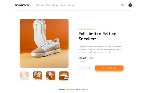
E-commerce product page

Solution retrospective
Can someone tell about best practices for this challenge?
Please log in to post a comment
Log in with GitHubCommunity feedback
- @juanprog97
hey Amritpal Singh, I see that you are missing the border that indicates the selected image, here is a solution so that you can lower the opacity and still have the border visible.
1- you should wrap the img in a div . For the div the border style is applied and in the child img the opacity is lowered and thus does not affect the visibility of the border. HTML
<div class="container-img"> <img src="https://http2.mlstatic.com/D_NQ_NP_658639-CBT50339432941_062022-W.jpg"> </div>
CSS
div.container-img{ display: block; width:300px; height: 300px; border: 6px solid black; } .container-img img{ width: 100%; height: 100%; opacity: 0.4; }
happy coding👍🏻🔥💯
- @sulemaan7070
hey Amritpal Singh😄, congratulations on completing the challenge here are a few tips to make your site better...
1.You can the
cursor:pointer
on the +,- and the delete svg..2.When I am adding 4 items.. and pressing the
Add to cart
the 4 should become 0.3.on the mobile: the images inside the carousel are getting squeezed you can use the
object-fit:contain
to tackle that problem..4.And for the (mobile-menu) or
.navigation
you can add.navigation { position: fixed; }
so that user cannot scroll down the menu..
Everything else looks great!! happy coding👍🏻🔥💯
Join our Discord community
Join thousands of Frontend Mentor community members taking the challenges, sharing resources, helping each other, and chatting about all things front-end!
Join our Discord