


Web Wizard• 5,690
@rsrclab
Posted
Hi, @jchapar ~ Congratulate on your solution to the challenge on FM platform.
I have studied your work and learned a lot from it. Here are some of the tips I like to provide.
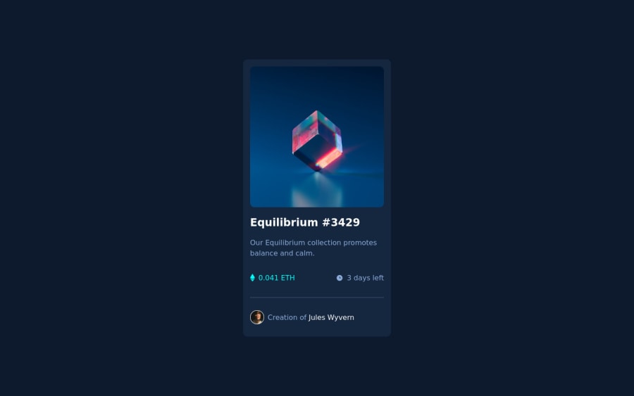
- Card style goes wrong on >1850px screen side. I think that's because you used max-width for main element. That could be serious issue, because many users use wider than that width nowadays.
- On smaller width, too much padding on both sides. That makes card shrunk, and it doesn't look good.
- I hope you to try BEM structuring. It will help you a lot on bigger projects.
https://www.frontendmentor.io/solutions/my-first-solution-on-chanllenge-V-4IzAivH
Here is my solution to this challenge, and I also tried sass. If it help you even a bit, that would be really great happy to me.
Happy coding ~
Marked as helpful
0

