e.g. : I divide the HTML Structure Header, medium, And Footer .

Solution retrospective
What would you do differently next time? Next time, I would:
Optimize Performance: Explore adding lazy loading for images and minimizing CSS to improve page load times. Incorporate a Framework: Consider using a CSS framework like Tailwind or Bootstrap to speed up development and standardize spacing and alignment. Enhance Accessibility: Dive deeper into accessibility features, ensuring a fully inclusive design with ARIA roles and improved keyboard navigation. Add Interactivity: Include JavaScript to enhance user engagement with dynamic content or animations. Experiment with Advanced CSS Techniques: Utilize CSS Grid for more complex layouts and test alternative design ideas to push creative boundaries. By reflecting on this experience, I aim to refine my development process and deliver even better solutions in the future.
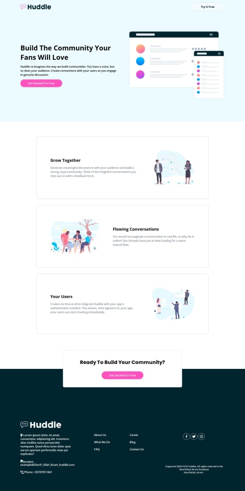
What challenges did you encounter, and how did you overcome them?Challenges Encountered and Solutions Responsive Design Complexity
Challenge: Ensuring the design worked seamlessly across all screen sizes, especially for the hero section and image placements. Solution: I utilized CSS custom properties and media queries to create a flexible layout. Testing extensively on different devices helped refine breakpoints and layouts. Consistent Spacing and Alignment
Challenge: Maintaining consistent padding, margins, and alignment throughout the project. Solution: I adopted a design system approach using reusable CSS variables (e.g., --padding-container) to ensure uniform spacing across sections. Color and Contrast Accessibility
Challenge: Choosing a color palette that was visually appealing while maintaining sufficient contrast for readability. Solution: I used tools like the WCAG Contrast Checker to validate color contrast ratios, ensuring the design met accessibility standards. Image Optimization
Challenge: Handling image quality and loading times for the background and section images. Solution: I optimized image files and experimented with background properties like background-size and background-position to achieve the desired effect without compromising performance. Lack of Interactivity
Challenge: The project was static, and adding interactivity could have enhanced user experience. Solution: While JavaScript was not part of the requirements, I noted areas where interactivity, like animations or hover effects, could improve usability for future iterations. These challenges pushed me to think critically and sharpen my CSS skills. Each solution brought valuable learning and confidence to handle similar obstacles in future projects.
What specific areas of your project would you like help with?Here are the specific areas where I would appreciate help and feedback:
-
Responsive Design on Smaller Screens
- Despite testing, I am unsure if the layout fully adjusts well on extremely small screens (e.g., mobile devices with smaller than usual viewports). I'd love feedback on how to improve the responsiveness of the hero section and text alignment on these smaller screens.
-
CSS Grid vs. Flexbox
- I used Flexbox for most of the layout, but I wonder if CSS Grid would be a better choice for some sections, especially for the main container and footer layout. Could Grid provide more control or cleaner code in this case?
-
Image Optimization Techniques
- I optimized images for faster loading, but I feel I could do more in terms of lazy loading or using modern image formats like WebP. Any suggestions on how to implement this effectively without harming SEO or user experience?
-
Color Accessibility
- While I used the WCAG checker, I am unsure if my color choices truly meet accessibility standards across all types of vision impairments. Would love feedback on ensuring maximum contrast and readability while keeping the design appealing.
-
Optimizing CSS for Performance
- Is there a more efficient way to structure my CSS? I am concerned that my large number of selectors and the use of multiple classes for styles might negatively impact performance. Any suggestions on optimizing CSS for faster load times and better performance?
Your input on these areas would help refine the project further!
Please log in to post a comment
Log in with GitHubCommunity feedback
No feedback yet. Be the first to give feedback on Sharifullahikram's solution.
Join our Discord community
Join thousands of Frontend Mentor community members taking the challenges, sharing resources, helping each other, and chatting about all things front-end!
Join our Discord