Equalizer landing page

Solution retrospective
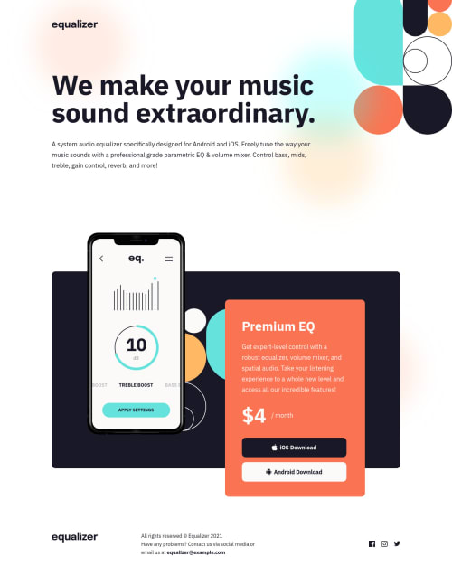
How did you guys do the middle section with the phone and textbox? i feel like i took a super convoluted approach lol i.e used flex in desktop with some margins, then i set the phone img to absolute positioning in medium sized screens, and then finally removed the absolute positioning and did flex-direction: column on mobile.
Please log in to post a comment
Log in with GitHubCommunity feedback
- @correlucas
👾Hello Jax, congratulations for your new awesome solution!
I liked a lots the custom features you've added here, like the intro animations, this is really great.
To manage the section with the phone and text box, I've used
z-indexandtransform: translateX()to manage the distance between these two elements and some media query to keep the spaces..card { z-index: 0; transform: translate(-74px, 120px); }If you want to see my solution, here is the link:
https://www.frontendmentor.io/solutions/equalizer-landing-page-pure-css-and-custom-hover-states-app-section-8AyB3NZFzjCongrats this solution is just great.
Marked as helpful

Join our Discord community
Join thousands of Frontend Mentor community members taking the challenges, sharing resources, helping each other, and chatting about all things front-end!
Join our Discord