Equalizer Landing Page | CSS Grid | Flexbox | Pure HTML && CSS

Solution retrospective
If you leave me some feedback, please leave me a request for a project of yours that you want me to have a look at. I'll be more than happy to help.
I learned a lot and found many useful resources whilst doing this project. I will share some of them below.
This is the first landing page challenge that I have done via Frontend Mentor. I spent a lot longer than I initially intended on this project.
This is the first time that I have ever done a mobile first responsive design. If you have any tips on how to improve please let me know.
This is the first time that I have tried so hard to make a website accessible. Any feedback would be great. I will list some of the issues below.
Issues
- When I used the <article> element was that use correct? Or, should I have used a <section> element?
- Was I right to use the <header> element within the <article> element?
- Should I have used the <address> element within the <footer>?
- Instead of using a reset CSS stylesheet I just added the styles that I wanted to reset manually. What's your opinions on reset sheets?
- I had trouble getting the background image to be displayed properly. I think it doesn't stand out enough and the positioning is wrong. Any tips on how to fix this?
- The <article> background color looks different from the design. What do you think? (I'm partially color blind).
- I used focus-visible styles. Did I do it correctly?
- I used the min and max CSS values. What do you think?
- Should I have used the <button> element or the <a> element for the navigation icons within the <footer>?
- How does my page fare on a screen reader?
- Is my useage of ARIA labels correct?
- Is my useage of the role attribute correct?
- Was I correct to use the <nav> element for the icons in the <footer>?
- Aaaaannnnnnyyyyyy help with accessibility would be awesome!
What I learned
- I used the filter property to style the icons in the <footer>. I found a great resource that allows you to enter a hex color and then returns a filter value to match that color. Resource listed below.
- I made use of the min and max CSS values which are really good for getting smooth responsive styles. I found a website that will do a lot of the calculations for you. Website listed below.
- I used the ALLY checklist for the first time. I found it quite helpful when addressing accessibility issues. Link below.
Useful resources
https://websemantics.uk/tools/responsive-font-calculator/ - Great for semantic fonts and sizing in general. https://codepen.io/sosuke/pen/Pjoqqp - Brilliant for changing the color of images when you want to add hover effects. https://www.a11yproject.com/checklist/ - Great tool for creating an accessible website.
Please log in to post a comment
Log in with GitHubCommunity feedback
- @RioCantre
Hello there! Awesome work with this one. Looking at your solution, I would like to suggest the following for you...
- Both
articleandsectionrequires one heading hierarchy. Both seems have the same functionality. For HTML structures, refer it with this one Semantics - The
headertag is used for the header content. Using it within another content would made it look complicated. To simplify things, better to use the common way.. like this one
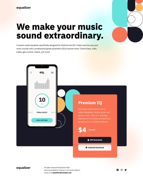
from: <article> <header> <h2>Premium EQ</h2> <p>...</p> </header> <p ></p> <button ></button> <button ></button> </article> into: <article> <h2>Premium EQ</h2> <p></p> <p class="price">$4 <span class="month" role="presentation">/ month</span></p> <button ></button> <button ></button> </article>- Use
addresstag when there is the relevant address information - Reset CSS stylesheet is a default style. Better to use specific CSS file for the main styling of the project.
- The background image in the design comparison, it looks fine.
- In your solution the background color is all white, can be adjust to something off white or similar
like
background: rgba(246, 242, 234, 1); - Its common to use
awith icons rather thanbuttons(can be use if different situation) in this case, theais good enough. - Try wrapping it with unordered list
ulandlifor the icons infooter
Above all, design is looking nice. Hope this helps and Keep it up!
Marked as helpful - Both

Join our Discord community
Join thousands of Frontend Mentor community members taking the challenges, sharing resources, helping each other, and chatting about all things front-end!
Join our Discord