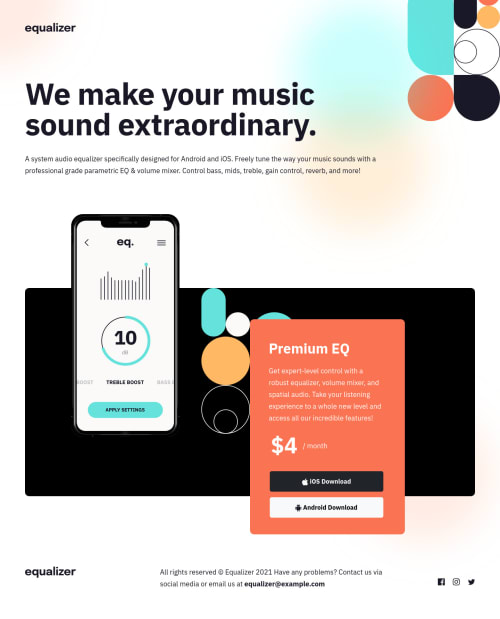
Responsive landing page using flexbox and mobile-first workflow

Solution retrospective
Hi folks, one main concern: the buttons seem to shrink a pixel or two on hover, and this is not the desired result, I used bootstrap to customize them, any thoughts? Thanks in advance! Feedback welcome! #newbie
Please log in to post a comment
Log in with GitHubCommunity feedback
- @KrzysztofRozbicki
Hey. Checked your code and it seems that :hover has only:
border: #66e2dc;It isn`t replacing the border-color with your color - it is like reseting the full border properties - so the border in this case has 0px - that is why it seems smaller .
There are few solutions:
you can either correct your code in :hover pseudoclass by replacing only the color value:
border-color: #66e2dc;Or IMO better option - you can add to your btn class or normalize css file property:
border: noneWhich simply removes any borders from your button making it plain and simple to style.
Marked as helpful

Join our Discord community
Join thousands of Frontend Mentor community members taking the challenges, sharing resources, helping each other, and chatting about all things front-end!
Join our Discord