@faruking
Posted
One way to do this is using a combination of flex-wrap, justify-content etc. But you might still need to tweak some things. modify the footer class style to:
width: 100%;
padding-inline: clamp(0rem, -6.107vw + 2.931rem, 1.5rem);
flex-wrap: wrap;
display: inline-flex;
justify-content: space-between;
after that you can remove the grid-template-column in media queries. Don't forget to also remove the display: grid and grid-template-column in the footer class.
@SamHemingway
Posted
@faruking Thanks for commenting!
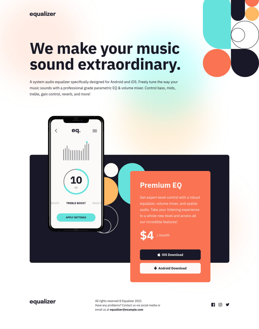
This was what I originally tried but couldn't figure out. What I can't figure out is how to achieve the 768px layout (aka with the logo taking up it's own row at the top and the other 2 dropping beneath it).
I created a branch with the suggested changes, here's what it looks like live. Any thoughts?
@faruking
Posted
@SamHemingway This is what you can do:
- wrap your equalizer image with a div having a class of 'footer-item'
<div class='footer-item'>
    <img src="assets/logo.svg" alt="equalizer" class="logo logo-footer" />
</div>
- the 2 classes below it should also have an additional class 'footer-item'
<div class="footer-body ">to<div class="footer-body footer-item"><div class="footer-socials" >to<div class="footer-socials footer-item" > - lastly, add the following to your global style
.footer-item:first-of-type{
  min-width: 340px;
}
Marked as helpful
@SamHemingway
Posted
@faruking Thanks!
I actually didn't end up implementing this in the end, but you helped me realise by suggesting adding a new parent into the DOM that nesting was the way forward!
Instead of creating an explicit width for the logo in the footer, I gave it a property of flex: 1 0 9.125rem as I wanted it to grow, but not shrink and ideally be that magic number, and then nested the footer content inside of another flexbox which has the property flex: 1 1 35rem as we want it to shrink and grow but ideally be 35rem.
@faruking
Posted
@SamHemingway That's creative, although I think you have some other errors relating to your images. Anyway, let's connect, Nice job by the way.

