equalizer Landing Page, vanilla HTML/CSS

Solution retrospective
So, I thought this was my first premium challenge, turns out it was my second. (I forgot the Pod Request Access Challenge
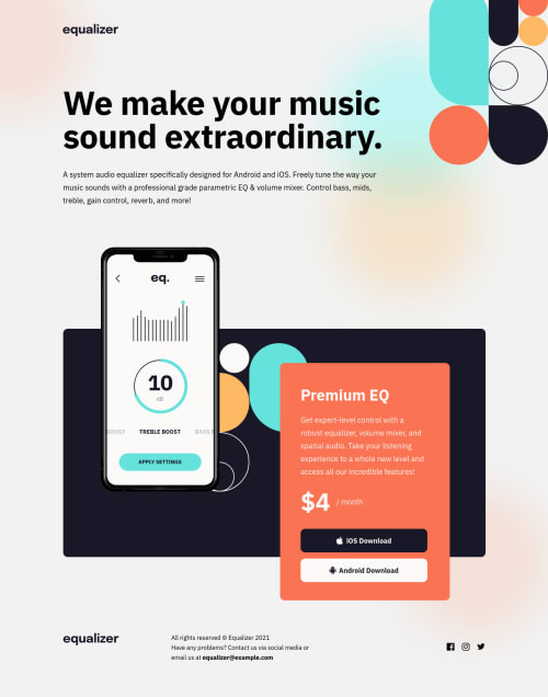
I realised as I was prepping for submission that I missed the middle section up. I built it around the red product card, and then used the psuedo ::before to add the image and the black square. On reflection, esp thinking about having the block centered for in between sizes, I think I should have done the black square as the main element, and then the image and red block in the psuedo ::before and/or ::after. Is that the correct approach?
I noticed that on the mobile and tablet versions that the design has the buttons and price block indented further than the header & block of text just above them. I followed the design here, but I was inclined to have them consistent across the three versions. If this was real life I feel I would have asked for clarity from the designer. Would that be a sensible descision?
Finally was the limited accessibility, particularly the aria-labels I added to the social links approriate or longer than necessary?
Please log in to post a comment
Log in with GitHubCommunity feedback
No feedback yet. Be the first to give feedback on Robert McGovern's solution.
Join our Discord community
Join thousands of Frontend Mentor community members taking the challenges, sharing resources, helping each other, and chatting about all things front-end!
Join our Discord