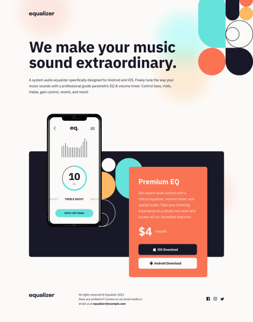
Equalizer landing page

Solution retrospective
Hi! I would really appreciate if someone could help me with:
- I still find hard to understand a design file. Where is the correct position for the background decoration bg-pattern-1? Do I add it to body or .container?
- Is there an easy way to convert px to em or rem? I've just started using them.
- How to set an image correctly, so it would be perfectly responsive))?
- I applyed :hover on icons. How do I make the transition between colors smoother?
- What is the best way to make a responsive website? I've got an idea what to do, but when I need to match a website to a designer view of a responsive layout, I really struggle;)
Thank you a lot in advance!
Please log in to post a comment
Log in with GitHubCommunity feedback
- @correlucas
👾Hello Galina , congratulations for your new solution!
❓ Answering your question:
1.If you're using VSCODE there is a plugin that allows you to convert automatically
px to rem. The name ispixel to rem. Here's the link:https://marketplace.visualstudio.com/items?itemName=sainoba.px-to-remHere's an online tool to convert:
https://codebeautify.org/rem-to-px-converter2.Its better you add the background images ever in the
bodyto make it stays underneath everything.3.A best practice to have all the image inside the container scaling and respecting the size of the container, you need to add
max-width: 100%and add alsoobject-fit: coverto make the image auto-crop when resizing inside the column:img { display: block; object-fit: cover; max-width: 100%; }✌️ I hope this helps you and happy coding!
Marked as helpful - @vermilion4
Hi Galina, nicely done👏... regarding your 4th question, you can add an ease-in-out, ease-in or ease-out to your transition as per your preference.
5th question: it depends on you really, most times you find yourself using flexbox or grid depending on if the layout is 1D or 2D, other times you might end up using frameworks like bootstrap and not to leave out your media queries. It's more like using what feels right at the moment?
Marked as helpful


Join our Discord community
Join thousands of Frontend Mentor community members taking the challenges, sharing resources, helping each other, and chatting about all things front-end!
Join our Discord