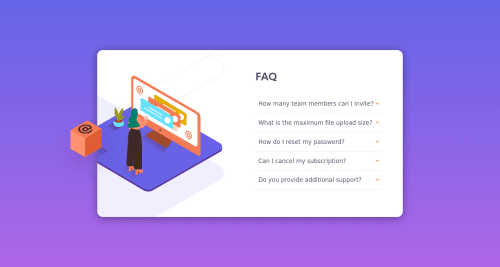
Solution retrospective
Any comments/suggestion for this solution is appreciated. I've done 3 challenges previously and this was by far more challenging as compared to the rest. Thanks.
Please log in to post a comment
Log in with GitHubCommunity feedback
- @cr1deg0
Hi Hemant,
It's a good solution, well done! I few things that you may want to revisit:
- it looks like your background gradient is going in the opposite direction to the design.
- you could increase the line spacing in the FAQ answers to make them easier to read.
Join our Discord community
Join thousands of Frontend Mentor community members taking the challenges, sharing resources, helping each other, and chatting about all things front-end!
Join our Discord