
Solution retrospective
What specific areas of your project would you like help with?
I’d really appreciate constructive feedback.
Code
Please log in to post a comment
Log in with GitHubCommunity feedback
- P@dar-ju
Hi, Tetiana!
Great job! For the ideal, I think you can make some changes:
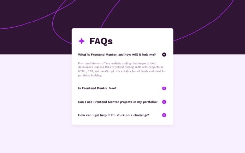
- the faq block jumps in both directions vertically when you click on the item, this can disorient the user. It is better to remove the centering of the main block and make padding at the top, then the block will only go down and the buttons will remain in the same place where they were clicked.
- this is a faq list, use ul\li for it, semantically it will be better
- item .faq__answer is more <p> than <div>
- at 599px where the media query goes, the faq block is too narrow, it is better to remove max-width and add padding left & right, especially since there are side paddings in mobile design
Otherwise, great!
Marked as helpful

Join our Discord community
Join thousands of Frontend Mentor community members taking the challenges, sharing resources, helping each other, and chatting about all things front-end!
Join our Discord