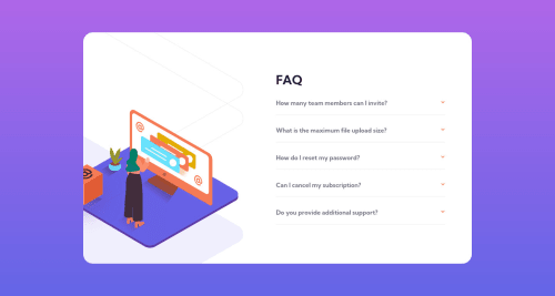
Submitted about 4 years agoA solution to the FAQ accordion card challenge
FAQ accordion card

@AndreiM987
Solution retrospective
I had a problem while solving this challenge. First time I clicked the content does not appear, but the second time it worked. I solve this adding inline css property: "display: none" for the content that should not be visible. I don't now if is correct but now it works. Any suggestions ?
Code
Loading...
Please log in to post a comment
Log in with GitHubCommunity feedback
No feedback yet. Be the first to give feedback on Andrei Minciuna's solution.
Join our Discord community
Join thousands of Frontend Mentor community members taking the challenges, sharing resources, helping each other, and chatting about all things front-end!
Join our Discord