


Raymart Pamplona• 16,140
@pikapikamart
Posted
Hey, awesome work on this one. Desktop layout looks really great, it is responsive and the mobile state looks great as well.
Carlos already gave feedback on this one, just going to add some suggestions as well:
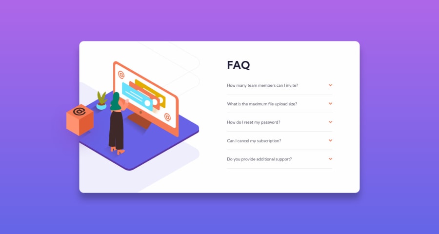
- Don't use
overflow: hiddenon thebodytag, try to inspect the layout while the styling is active, you will notice that you can't scroll because of that style props. - Always have a
mainelement to wrap the main content of your page. On this one, the.cardshould be using themaininstead ofarticle. - For those decorative images that are using
alt="", add an extraaria-hidden="true"on it so that it will be totally hidden for screen-reader users. - For those accordion, using
atag is not really intended for those because you only useatag for links and that is not a link at all. Instead , use thedetailselement for the accordion as they are intended to be used that way and it is accessible right from the start so you won't have to manipulate attributes of the element. - The arrow-icon should be hidden since it is only decorative image. Only use descriptive
altfor images that are meaningful and add content. Otherwise usealt=""andaria-hidden="true"on theimg.
Aside from those, great job again on this one.
Marked as helpful
2
CyrusKabir• 1,885
@CyrusKabir
Posted
@pikamart hello my dear friend . thanks for your great feedback the only reason for using <a> tag it was just for have open and close functionality with css you know using :target and this stuff Otherwise, I will follow all the points you said both in this project and in the next projects. Thank you again.
1

