FAQ accordion card responsive page | css

Please log in to post a comment
Log in with GitHubCommunity feedback
- @gtalin
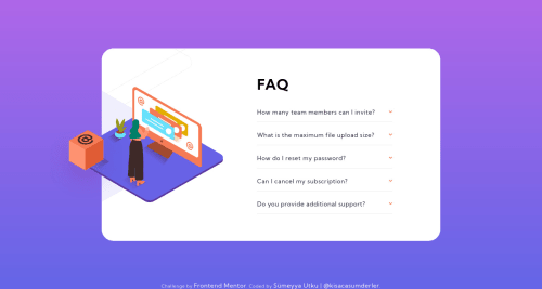
Congratulations on completing the challenge. The layout is very well done and the font size is apt as well. The shift in the background image in this challenege is quite tricky to get right.
I really like the animations that you have put in for the accordion (the arrow icon as well as the list items themselves.)
I just have one small suggestion that in the desktop view, as soon as the layout switches to larger screen size view, there is no margin in the top and bottom. Adding a margin in the
accordionContainer, of1remor something would be great. (In larger screen sizes the accordion container itself is smaller and is centered on the screen so there is no problem there).Hope you don't mind the feedback.

Join our Discord community
Join thousands of Frontend Mentor community members taking the challenges, sharing resources, helping each other, and chatting about all things front-end!
Join our Discord