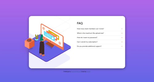
Not Found
Not Found
Not Found
Not Found
Not Found
Not Found
Not Found
Not Found
Not Found
Not Found
Not Found
Not Found
Not Found
Not Found
Not Found
Not Found
Not Found
Not Found
Not Found
Not Found

Submitted

FAQ accordion card with html, css and javascript

Toyger 155

@hacmaz123456

Desktop design screenshot for the FAQ accordion card coding challenge

This is a solution for...

  • HTML
  • CSS
  • JS
1newbie
View challenge

Design comparison


SolutionDesign

Solution retrospective


Please give me some feedback, i think my script need to optimize :D I can make this thing like in design (with 1 media query at 375px), but it too hard if you wanna see content between around 376px - 800px, so i split it to 3 parts. Did i do anything wrong? Sry for my bad english. Thank you!

Community feedback

P
ApplePieGiraffe 30,545

@ApplePieGiraffe

Posted

Hello, Toyger! 👋

Nice work on this challenge! 🙌

In addition to the great feedback you've already received, one more tiny thing I suggest you do to improve your solution is to make the titles of the FAQs bolded when they are opened (as in the original design) so that it's easier to distinguish them from the answer of the FAQ. 😀

Also, I think adding a bit of margin/padding to the bottom of the accordion card to give it some space between itself and the attribution at the bottom of the screen (in the mobile layout) would be a nice idea! 😉

Keep coding (and happy coding, too)! 😁

2

Toyger 155

@hacmaz123456

Posted

@ApplePieGiraffe Thank for your suggest :D

0
Adam 430

@aemann2

Posted

Hi Toyger,

One easy improvement would be to make your HTML more semantic. It would be easy, for example, to switch out some of the div sections in the text dropdowns with details elements.

It also looks like your FAQ section is sliding over into the left side of your card when the window shrinks and cutting off the image there. You can fix that by setting the width of the card with just width rather than using max-width.

I think you should also find a way to center the card -- right now you've got margin-top pushing the card down, but if someone's screen is a little too small, it cuts off the bottom of the card. Maybe use flexbox, or one of the centering strategies here:

https://css-tricks.com/centering-css-complete-guide/

I struggled with this one also, and it's interesting to see that we did some of the same things. I also wrote my Javascript so that the user can only open 1 according section at a time.

2

Toyger 155

@hacmaz123456

Posted

@aemann2 Thank you, im stuck with this image for 2 days, and i think i need to deal with it again lul : d

1
Gerben Dol 3,115

@GerbenDol

Posted

Hey Toyger,

I think your solution is looking really good! 🙌🏻

The things I found are that:

  • The animation on the answer in the FAQ is a bit slow
  • The hover on the answer is a bit odd. The color changing and the cursor becoming a pointer suggests the answers is somehow interactive.

Curious to see what feedback other people have! Keep up the nice work! 💪🏻

2

Toyger 155

@hacmaz123456

Posted

@GerbenDol Thank you very much xD

1

Please log in to post a comment

Log in with GitHub
Discord logo

Join our Discord community

Join thousands of Frontend Mentor community members taking the challenges, sharing resources, helping each other, and chatting about all things front-end!

Join our Discord