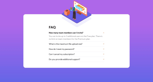
FAQ accordion card with React and Styled components

Solution retrospective
This is my final project. It got really complicated trying to make it responsive with the 3 images, it looked really bad so I changed it for big screens. I couldn't figure out how to make the questions to open smoothly with transition. Also couldn't figure out how to make the images to cut off at the adge on big screen. z-index didn't help, in dev tools it said that the z-index cannot apply because of position:static, but I didn't have position:static anywhere. Any ssuggestions and help will be really appriciated. Thank you
Please log in to post a comment
Log in with GitHubCommunity feedback
- @wendyhamel
Hi Marina, Good job taking on this challange! You are right, making this one responsive is complicated.
The smooth transitions for the answers is a problem. You can't transition dynamic height (
height:auto), it needs absolute values. You can tinker around with it, but I often end up with it still beeing a bit janky. Theposition: staticis the default position for all elements, if you don't specify a position yourself. To make this work in this challange you will need to work withposition:relativeandposition: absolute. The element (adivfor example) containing the image should haveposition:relativefor the image withposition:absoluteto work. In this challange you will need two different locations for the two different images to show properly on different screen sizes.If you like to improve some more, you could work on the accessibility. If you use more semantic HTML elements, your solutions will be better accessible for screen readers and by keyboard. A
<ul>with<li>items for example to show the questions and you could use the<details>element for the separate questions.Good places to learn:
mozilla
- about position
- about transition
- about accessibility
- about the details element
css tricks
I do not want to reveal too much about how you could do this, it helps to figure out your own approach. But if you get stuck, Keep asking questions and don't give up!

Join our Discord community
Join thousands of Frontend Mentor community members taking the challenges, sharing resources, helping each other, and chatting about all things front-end!
Join our Discord