Skip to content
  • Unlock Pro
  • Log in with GitHub
Solution
Submitted over 4 years ago

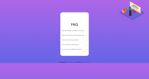
FAQ Accordion. HTML CSS and JavaScript.

Gerison•40
@gerkim62
A solution to the FAQ accordion card challenge
View live sitePreview (opens in new tab)View codeCode (opens in new tab)

Solution retrospective


It's not working on desktop. How can I make it responsive?

Code
Select a file

Please log in to post a comment

Log in with GitHub

Community feedback

  • Anne-Sophie•245
    @annesophie22
    Posted over 4 years ago

    Hi there :)

    From what I can see, here are some hints that might help you : -- you used position: absolute on your illustration without declaring any parent container as position: relative. Meaning that your image has an absolute position based on the "position" of your body. That's why on desktop, your image is 45px from the right side of the window, and 12px from the top of your window. If your plan was to use position absolute to place your image on the top of your wrapper, then you would need to declare position: relative on your wrapper container.

    -- instead of using position absolute to position your illustration, try to use margin-top instead, by declaring a negative value. Something like -100px worked quite well when I tried in my browser.

    -- the "easiest" way to make your layout responsive is to use flexbox for desktop version. For this to work, inside your wrapper you will need 2 container : 1 for your illustration and 1 for the rest of your content (h1 + your onefaq divs). Then you can declare your wrapper as flex, which should get your illustration just next to the rest of your content. Then you need to play with flex position a bit to get what you want.

    -- Once you're comfortable with flexbox, you can improve your code and css by building your onefaq div with flexbox as well. This means that instead of using position: absolute for your icon-arrow-down, you use flexbox to control its position.

    My advice would be to learn a bit more on flexbox (have a look on css tricks website) and try again this challenge. You'll see that your life will be much more easier than with absolute positioning :)

    Flexbox, grid layouts and declaring width with % instead of with px are some of the best ways to achieve responsive layouts.

    Good luck !

    Marked as helpful
  • Ryan•0
    @ryannisbet
    Posted over 4 years ago

    Have a research into media queries, this is how you make things responsive for different devices.

Join our Discord community

Join thousands of Frontend Mentor community members taking the challenges, sharing resources, helping each other, and chatting about all things front-end!

Join our Discord

Stay up to datewith new challenges, featured solutions, selected articles, and our latest news

Frontend Mentor

  • Unlock Pro
  • Contact us
  • FAQs
  • Become a partner

Explore

  • Learning paths
  • Challenges
  • Solutions
  • Articles

Community

  • Discord
  • Guidelines

For companies

  • Hire developers
  • Train developers
© Frontend Mentor 2019 - 2025
  • Terms
  • Cookie Policy
  • Privacy Policy
  • License

Oops! 😬

You need to be logged in before you can do that.

Log in with GitHub

Oops! 😬

You need to be logged in before you can do that.

Log in with GitHub

How does the accessibility report work?

When a solution is submitted, we use axe-core to run an automated audit of your code.

This picks out common accessibility issues like not using semantic HTML and not having proper heading hierarchies, among others.

This automated audit is fairly surface level, so we encourage to you review the project and code in more detail with accessibility best practices in mind.

How does the CSS report work?

When a solution is submitted, we use stylelint to run an automated check on the CSS code.

We've added some of our own linting rules based on recommended best practices. These rules are prefixed with frontend-mentor/ which you'll see at the top of each issue in the report.

The report will audit all CSS, SCSS and Less files in your repository.

How does the HTML validation report work?

When a solution is submitted, we use html-validate to run an automated check on the HTML code.

The report picks out common HTML issues such as not using headings within section elements and incorrect nesting of elements, among others.

Note that the report can pick up “invalid” attributes, which some frameworks automatically add to the HTML. These attributes are crucial for how the frameworks function, although they’re technically not valid HTML. As such, some projects can show up with many HTML validation errors, which are benign and are a necessary part of the framework.

How does the JavaScript validation report work?

When a solution is submitted, we use eslint to run an automated check on the JavaScript code.

The report picks out common JavaScript issues such as not using semicolons and using var instead of let or const, among others.

The report will audit all JS and JSX files in your repository. We currently do not support Typescript or other frontend frameworks.

Oops! 😬

You need to be logged in before you can do that.

Log in with GitHub

Oops! 😬

You need to be logged in before you can do that.

Log in with GitHub