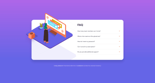
FAQ Accordion - Mobile first responsive // HTML5, CSS

Please log in to post a comment
Log in with GitHubCommunity feedback
- @ACdev27
There seems to be something strange about the picture element you are using with class="image-container". If you add a border to that element you will see it is much smaller than image. I'm not sure it best choice for this situation. But, I have not used <picture> very often lately.
If you have trouble working with, you might try just using a div for the left side of card, and add the image as a background images. This may simplify things compared to working with <picture>
Then you can add the second image (bg pattern desktop) as a background image and be able to "lock" them together. Right now they move apart as the screen get more narrow. That way both images would be the background for the same element, in this case the div, and would work better together. Since I think they need to stay together.

Join our Discord community
Join thousands of Frontend Mentor community members taking the challenges, sharing resources, helping each other, and chatting about all things front-end!
Join our Discord