


@pikapikamart
Posted
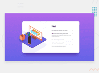
Hey, nice work on this one. Desktop layout looks fine, just needed for the container to be a bit shorter and for it to be centered on the screen properly. For mobile state, a horizontal scrollbar appears and also, the top image is not responding on the size changes.
Others already gave their feedback, just going to add some suggestions as well:
- Always add a styling with:
html {
 box-sizing: border-box;
}

*,
*::before,
*::after {
 box-sizing: inherit;
}
This way, an element's sizing will be properly controlled and using padding or margin will be easier and the padding won't add size to element if it already includes a sizing.
- Instead of using
padding-topon themainandpadding-bottomon thebodytag to center the content, you can use:
  display: grid;
  min-height: 100vh;
  place-content: center;
On the body tag, this way the centering of the element will be consistent and also adding some general padding on the body tag would be nice.
maindoesn't needdisplay: blocksince it is block element my default.- Instead of using
widthon the.containerelement to give size, usemax-widthinstead. This way, you won't have to declare multiplewidthfor every breakpoint you add just to prevent the user's screen from touching the element since it will be respond on it, compared towidthwhich will just add a fixed width. - Adding an extra
aria-hidden="true"on theimgso that it will be totally hidden for other screen-reader. - For each of the faq question, since you are adding a
:hoverstate on each question, it implies that those are interactive and that's why you should use interactive element like abuttonor on this one, a better approach without using javascript would be to usedetailselement. It is already accessible. - The arrow-icon
imgshould be hidden as well and again, interactive components need to use interactive element, making animgacts likebuttonshould not be used sinceimgis not interactive. - For the breakpoint, I think 1000px is too early to show the mobile view, adjusting it would be nice.
- You can remove the
widthfrom the.boxselector so that the layout won't be stuck at the size when a user have a thinner mobile device. - Lastly, instead of using:
  left: 45px;
  position: relative;
  top: -185px;
  width: 300px;
You can just remove those and use:
  transform: translateY(" add your value");
  max-width: 300px;
This way, the img will scale.
Aside from those, great job again on this one.
Marked as helpful
@Old1337
Posted
@pikapikamart thank you so much for your valuable feedback


