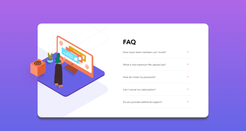
FAQ component with HTML CSS and JS

Solution retrospective
Hi all,
This is my second attempt on making this page responsive. I would like to know if the css in the media queries and the the way I have used the flexbox and position rules is the right way to go about it.
(NB: I have not implemented responsiveness for landscape mode or the media queries for vertical height)
Please log in to post a comment
Log in with GitHubCommunity feedback
- @grace-snow
Hi Anjali
I had a look at this in browser and in all honesty I would start this again, or at least the css. I started making changes in browser (desktop) but there were just so many....
I think as Dave suggests the most important things are to get rid of almost all position properties in this, styling on classes not IDs, changing structure so images aren't nested inside unnecessary divs.
Really, I recommend doing a few other challenges first to learn more about layouts with css, then come back to this later on.
I'll copy how far I got fiddling with the browser styles below so you can see some of the changes needed, but these are far from complete, and I've probably made changes inside the wrong media-queries/widths as I was only looking on desktop.
Gotta head to work now :)
/* styles.css | https://faq-accordion-card-main-bay.vercel.app/styles/styles.css */ @media only screen and (min-width: 1000px) { html { /* width: 100%; */ } body { /* height: 100vh; */ /* text-align: left; */ min-height: 100vh; margin: 0; padding: 1rem; display: grid; place-content: center; } body > #container { /* position: relative; */ /* top: 130px; */ /* width: 1000px; */ /* height: 550px; */ /* background-size: auto; */ /* background-position-x: -554px; */ // don't use pixels for these /* background-position-y: -288px; */ max-width: 1000px; background-size: 60%; background-position-x: -38%; background-position-y: -1rem; // only because I've positioned the woman img with rems too } .images { /* position: absolute; */ /* height: 100%; */ } #accordion-container { /* position: absolute; */ /* left: 500px; */ /* top: 90px; */ /* justify-content: left; */ } // title needs to be a heading element. it is text align left by default .title { /* text-align: left; */ } #questions { /* width: auto; */ } .img-woman #woman { /* left: -79px; */ /* top: 70px; */ /* width: auto; */ } } // HTML doesn't need centering. That's like the paper on your printed document. html { /* overflow: hidden; */ /* margin: 0 auto; */ margin: 0; height: 100%; } // You should not be styling using IDs at all, especially not nested like this body > #container { /* width: 365px; */ /* height: 600px; */ } #accordion-container { /* position: relative; */ /* left: -135px; */ /* top: 120px; */ /* max-width: 310px; */ /* display: flex; */ /* flex-direction: row; */ /* justify-content: center; */ padding: 1rem; } #questions { /* margin-left: 0; */ /* top: 40px; */ /* position: absolute; */ /* width: 300px; */ } .img-woman #woman { /* position: relative; */ /* left: 77px; */ /* top: -100px; */ /* width: 220px; */ transform: translateY(4.5rem) translateX(-4.25rem); } #accordion-container .title { margin: 2rem 0; } .summary + p { /* padding: 1em 0; */ /* font-size: 14px; */ padding: 0; font-size: 0.875rem; // ALL font sizes in rems margin-top: 0; } details { /* margin-top: 2rem; */ margin-top: 1.75rem; } body { /* height: 100vh; */ min-height: 100vh; } - P@dwhenson
Hi @aj-menon 👋 - great work on this one. It looks very nice on desktop, and mobile too. I've added some suggestions below that you might like to consider:
- In general, I try to avoid using the
positionproperty unless I really have to, and rather rely on using the natural flow of the HTML where possible. This will make your code much less complicated.
For example, in this case I removed,
positionfrom your #questions, and the fixedheightfrom the #container, and now the element expands to fit the content as it increases.(Generally, I also avoid setting a
heighton elements, this also causes problems!)- Instead of using
marginin your animation, I would suggest replacing this with something liketransform: translateYand then the same values. This should hopefully help with performance and make things smoother.
I think your use of
flexlooks good to me, if you were to focus on anything I would suggest the first point is most important as if you can get used to this kind of approach it will help with all your challenges.I hope this helps! Great work and keep it up! 🙌 Cheers 👋
- In general, I try to avoid using the


Join our Discord community
Join thousands of Frontend Mentor community members taking the challenges, sharing resources, helping each other, and chatting about all things front-end!
Join our Discord