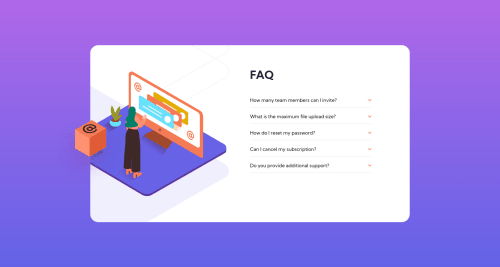
Not Found
Not Found
Not Found
Not Found
Not Found
Not Found
Not Found
Not Found
Not Found
Not Found
Not Found
Not Found
Not Found
Not Found
Not Found
Not Found
Not Found
Not Found
Not Found
Not Found

Submitted

FAQ-Accordion-Card

#sass/scss#bem
P

@12Kentos

Desktop design screenshot for the FAQ accordion card coding challenge

This is a solution for...

  • HTML
  • CSS
  • JS
1newbie
View challenge

Design comparison


SolutionDesign

Solution retrospective


SCSS is definitely a little messy, but was able to get the job done.

One thing I wasn't sure about is, the box on the desktop view, doesn't shrink/move when the view gets adjusted, I'm not sure why. Any ideas?

Thanks!

Community feedback

Aadvik 1,250

@Aadv1k

Posted

this is because of the way your app is centered and the approach, this is why you should opt for a mobile first approach, on mobile do something like .card { width: 80%; max-width: 700px} and done, simple as that, no need to worry about the sizing, and also, when centering elements horizantally within the body use margin: 0 auto and use position absolute for the vertical centering, sorry if my comment is a bit vague, feel free to ask me anything

Marked as helpful

1

P

@12Kentos

Posted

@Aadv1k Thanks for the reply! I just wanted to check and make sure we are talking about the same thing haha, I should have been more clear when I posted. I'm talking about the box that has the @ on it. It's halfway off the FAQ card, on the left side, is that what you are also talking about?

Thanks!

0
Aadvik 1,250

@Aadv1k

Posted

@12Kentos I was actually talking about the card itself, the main thing, just a simple suggestion that will save you a lot of troubles related to responsive design, rest everything in your design looks really great

0
P

@12Kentos

Posted

@Aadv1k Makes sense, I appreciate it. I've thought about doing mobile first, but don't actually have any experience in it. I will probably try it out in some future projects, as towards the end when I was working on the mobile part of this project, I had the thought of "this would probably have been a lot easier had I done it mobile first..." lol. 🤦‍♂️

1
Aadvik 1,250

@Aadv1k

Posted

@12Kentos Happens with me too, for my last few projects I've been working with tailwind and it makes it soo easy, because the breakpoint by default start from 640px so you are forced to use a mobile first approach I would recommend you give it a try

0
P

@12Kentos

Posted

@Aadv1k Thanks, I appreciate the feedback!

0

Please log in to post a comment

Log in with GitHub
Discord logo

Join our Discord community

Join thousands of Frontend Mentor community members taking the challenges, sharing resources, helping each other, and chatting about all things front-end!

Join our Discord