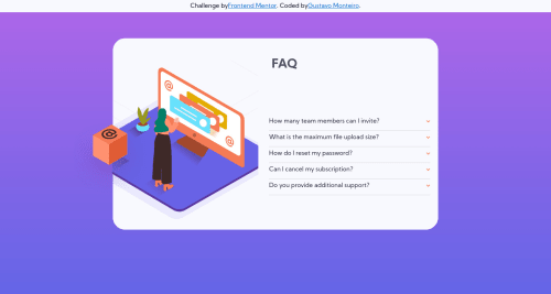
faq-accordion-card-main (HTML, CSS ONLY)

Solution retrospective
I had some difficulties in using the background and some doubts about the grid, but I think it is average, but what I want is to always improve.
If you notice something wrong or you know a better way to do something please tell me XD Every feedback is important
Please log in to post a comment
Log in with GitHubCommunity feedback
- @pikapikamart
Hey, just to point some things. I think it will be prettier to make your input tags? The ones that you made visibility hidden? Make it display none, even though display none is on, it will still function like :checked, cause when you visibility hidden, the item is hidden of course, but still leaves their space, there is still a box that is left out of the item that is hidden. Just make it display none so that no extra space will be used. Also your layout is kinda off in desktop? If you use min-width, from that resolution onwards, so your media of min-width: 1440px, only people with resolution higher than that will get the proper look. Try changin it to max-width or lower the resolution of the min width^^
Join our Discord community
Join thousands of Frontend Mentor community members taking the challenges, sharing resources, helping each other, and chatting about all things front-end!
Join our Discord