Fetch API to get JSON data

Solution retrospective
I found the css part really challenging. I could not make the website responsive for small screen size devices.
Please log in to post a comment
Log in with GitHubCommunity feedback
- @elaineleung
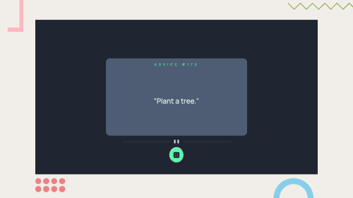
Hi Anub, great work putting this together, and I have to say, I am super impressed that you even managed to replicate the preview styles with all the patterns! Just so you know, what gets used in the design screenshot is only the desktop and mobile views, and not the preview, so that's something to keep in mind!
In any case, to fix the responsiveness, what I would do is remove all the absolute positioning for all the elements except the dice, and I would not use fixed widths. Here's what I would do instead for some basic styles:
body {
   background-color: hsl(218, 23%, 16%);
   min-height: 100vh;
   display: flex;
   justify-content: center;
   align-items: center;
}
.advice-main-container{
   width: min(100%, 30rem);
   position: relative;
   margin-inline: auto;
}
.advice-card-container {
   padding: 2rem;
   margin: 1rem;
}
.divider {
  margin-top: 1rem;
}
.divider {
  height: 15%;
  width: 100%;
  display: flex;
  justify-content: center;
  align-items: center;
}
#dice {
   background-color: hsl(150, 100%, 66%);
   position: absolute;
   height: 3rem;
   width: 3rem;
   bottom: -2rem;
   left: 0;
   right: 0;
   margin-inline: auto;
   border-radius: 50%;
   display: flex;
   justify-content: center;
   align-items: center;
   cursor: pointer;
   border: none;
}
Also, for the divider SVG, if it's fixed and can't be resized, try adding
viewBox="0 0 444 16"as an attribute in the SVG.Anyway, hope some of this can help you out; this almost needs a complete rewriting, but I think it's good to practice how to do positioning property before moving onto the next challenge. Good luck!
Marked as helpful

Join our Discord community
Join thousands of Frontend Mentor community members taking the challenges, sharing resources, helping each other, and chatting about all things front-end!
Join our Discord