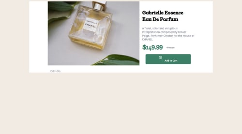
first attempt at a responsive site with media queries

Solution retrospective
proud that its somewhat responsive
What challenges did you encounter, and how did you overcome them?Originally I had the add to cart button looking perfect and at some point I did something that messed it up I spent over an hour trying to figure it out and could not find the problem. I started this project with mobile first this was my first time using a media query and it works somewhat its responsive but you'll see that when you open it to a bigger screen size it doesn't look accurate, I was stuck with trying to make the main image look like it is supposed to
What specific areas of your project would you like help with?using media queries and making everything transition smoothly like it should
Please log in to post a comment
Log in with GitHubCommunity feedback
No feedback yet. Be the first to give feedback on Jdaans's solution.
Join our Discord community
Join thousands of Frontend Mentor community members taking the challenges, sharing resources, helping each other, and chatting about all things front-end!
Join our Discord