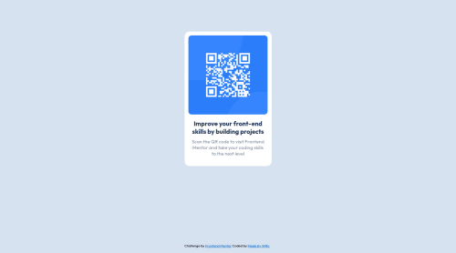
Submitted about 4 years agoA solution to the QR code component challenge
First Challenge Complete - HTML and CSS
LVL 2

@Louise-Ann93
Solution retrospective
As my first frontend mentor challenge I thought i'd start small, a small component with just HTML and CSS. This was my experience;
Challenges I faced:
- I've definitely become accustom to the luxury that is VueJs and Tailwind CSS frameworks. It was like muscle memory to type in a tailwind class just to tweak some margin, in reality it was much back and forth between style sheets. I had to google more basic css than i'd like to admit.
- Importing the font was new to me, it's not something i've done before. Seems simple enough, in practice it didn't want to play ball at first.
- Being on one monitor, just my laptop it was quite difficult to look by eye if my sizing was completely right, too much or too little padding in places?
- At the end i worry i may have over complicated it a little.
Take aways;
- Great experience again with HTML and CSS, made me realise how comfortable i had gotten and not in a good way.
- Made me excited to take on more challenges.
Now i know there was no right way in completing this challenge but i would please appreciate someone taking a look and letting me know what i could have done either better or was there a way i could have simplified things? Over use in CSS that i maybe didn't need?
Code
Loading...
Please log in to post a comment
Log in with GitHubCommunity feedback
No feedback yet. Be the first to give feedback on Louise Willoughby’s solution.
Join our Discord community
Join thousands of Frontend Mentor community members taking the challenges, sharing resources, helping each other, and chatting about all things front-end!
Join our Discord