first challenge , this my first deploy here and not last

Solution retrospective
i deploy my seconde challenge
Please log in to post a comment
Log in with GitHubCommunity feedback
- @krushnasinnarkar
Hi @aymenezz,
Your solution is great.
Here are some key points and suggestions:
CSS Changes-
General Styling:
- Set root variables for colors and box shadow.
- Applied a common font, background color, and text color to the body.
:root { --whiteColor: #ffffff; --primaryColor: #8a2be2b0; --secondaryColor: #39393aed; --highlightColor: #1f1f1fe0; --textColor: #333; --lightTextColor: rgba(255, 255, 255, 0.6); --boxShadow: 0 4px 6px rgba(0, 0, 0, 0.1); } body { font-family: Arial, sans-serif; color: var(--textColor); background-color: #f0f2f5; margin: 0; padding: 0; } -
Grid Container Styling:
- Used a grid layout for the
.packgecontainer with gap and padding.
.packge { display: grid; grid-template-columns: repeat(8, 1fr); grid-template-rows: repeat(5, auto); gap: 20px; padding: 20px; margin: 0 auto; max-width: 1200px; } - Used a grid layout for the
-
Section Box Styling:
- Applied background colors, border-radius, padding, box-shadow, and color for each section.
- Differentiated section colors for visual distinction.
.div-one, .div-tow, .div-three, .div-four, .div-five { background-color: var(--primaryColor); border-radius: 8px; padding: 20px; box-shadow: var(--boxShadow); color: var(--whiteColor); } .div-one { background-color: var(--primaryColor); grid-column: 1 / 4; grid-row: 1 / 3; background-image: url(bg-pattern-quotation.svg); background-repeat: no-repeat; background-position: top right 18%; } .div-tow { background-color: var(--secondaryColor); grid-column: 4 / 6; grid-row: 1 / 3; } .div-three { background-color: #ffffff; grid-column: 6 / 8; grid-row: 1 / 7; color: var(--textColor); } .div-four { background-color: #ffffff; grid-column: 1 / 3; grid-row: 3 / 7; color: var(--textColor); } .div-five { background-color: var(--highlightColor); grid-column: 3 / 6; grid-row: 3 / 7; } -
Typography Styling:
- Set margins, font sizes, and colors for headings (
h4), paragraphs (p), and spans.
h4 { margin-top: 10px; margin-bottom: 10px; font-size: 1.2em; color: var(--whiteColor); } p { margin-top: 10px; font-size: 1em; line-height: 1.6; color: var(--lightTextColor); } span, .div-in-one, .div-in-tow, .div-in-three, .div-in-four, .div-in-five { font-size: 0.9em; color: var(--lightTextColor); } - Set margins, font sizes, and colors for headings (
-
Image Styling:
- Styled images with dimensions, border-radius, background size, repeat, and border.
- Assigned specific images to respective sections.
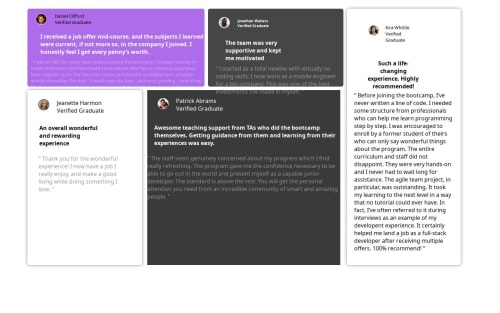
.div-one div[title='image'], .div-tow div:first-child, .div-three div:first-child, .div-four div:first-child, .div-five div:first-child { width: 50px; height: 50px; border-radius: 50%; display: inline-block; background-size: cover; background-repeat: no-repeat; border: 2px solid var(--whiteColor); } .div-one div[title='image'] { background-image: url('/css/image-daniel.jpg'); } .div-tow div:first-child { background-image: url('/css/image-jonathan.jpg'); } .div-three div:first-child { background-image: url('/css/image-kira.jpg'); } .div-four div:first-child { background-image: url('/css/image-jeanette.jpg'); } .div-five div:first-child { background-image: url('/css/image-patrick.jpg'); } -
div-in-one, ....:
- Remove Transform and height property and make div as inline block.
   .div-in-one,
   .div-in-tow,
   .div-in-three,
   .div-in-four,
   .div-in-five  {
           display: inline-block
   }
These changes will create a clean, readable, and visually appealing layout with proper spacing, typography, and color scheme.
There are still few thing need to work one, I think its enough for the beginner.
also one more suggestion is that stop using different class names for same styling. like instead of div-in-one, .div-in-tow, .div-in-three, .div-in-four, .div-in-five you can just use single class name as all uses same styling so need to give seperate class name.
Feel free to reach out if you have more questions or need further assistance.I hope you find my feedback valuable, and I would appreciate it greatly if you could mark my comment as helpful if it was! -

Join our Discord community
Join thousands of Frontend Mentor community members taking the challenges, sharing resources, helping each other, and chatting about all things front-end!
Join our Discord