@Da-vi-de
Posted
Hi, you don't need to worry about the exact design size, it's not a requirement, it means that at that width your project should look like the design!
-
If you work with dev tool open (on responsive mode) in your favorite browser then start coding at
350px, although the smallest mobile screen width should be320px. Once you've finished increase the width until you see the UI is changing too much, usually that happens at around500px(tablet width), be aware that there are projects here on FEM with tablet design as well, in many of them you need to change or add things! You repeat the process for all the main breakpoints768px,900 and somethingand so on... This way of working is called mobile first. -
When it comes to responsive design the hardest thing to do is making good development choices since the beginning, those choices can make the difference throughout the project.
Hope it helps a little, keep coding :-)
Marked as helpful
@harryHerdiana
Posted
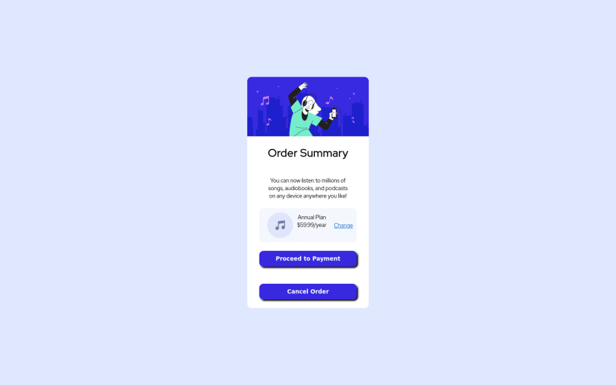
@Da-vi-de Hi, thanks for your explanation. So I should start from mobile first. But did you know in my submitted solution the content is scaling when the resolution changes? It make some text overlapped, until reach certain resolution on media queries that I specify the styling to fit that resolution.
@Da-vi-de
Posted
@harryHerdiana That is quite normal! As i stated above the design breaks because it changes the resolution so you need media queries, but what you did in your project is coding first for a large screen, it should be the opposite!
Marked as helpful
@harryHerdiana
Posted
@Da-vi-de Thank u so much Davide!

