


@LuisJimenez19
Posted
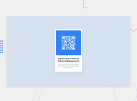
Hello, congratulations on finishing the challenge.
I see you're using mediaqueries, and that's ok, I don't know if you achieved what you wanted to practice but the design doesn't rise to the challenge. I advise you that for this type of project it is not necessary to use mediaqueries, so do this:
-grid:
body {
    background-color: hsl(212, 45%, 89%);
    display: flex;
    min-height: 100vh;
    display: grid;
    place-content: center;
}
- flex:
body {
    background-color: hsl(212, 45%, 89%);
    display: flex;
    min-height: 100vh;
    display: flex;
    alignment-items:center;
    justify-content:center;
}
And the content will focus. If what you want is that the size changes with respect to it, you can use relative measurements, instead of static ones. -example:
.flex-parent {
    display: flex;
    flex-direction: column;
    justify-content: center;
    height: 450px;
    width: 90%;
    max-width:300px;
    background-color: hsl(0, 0%, 100%);
    border-radius: 20px;
}
Stop using positioning so much, it's a bit simpler.
CSS also has certain functions like calc() in conjunction with relative measurements you can make the content change dynamically as you resize the window.
font-size: cal(1em - 2vmin)
If you want you can go deeper MDN
With practice we are improving, I hope my help is useful.👋🏽
Marked as helpful
@samanthaKarungi
Posted
@LuisJimenez19 very helpful thank you!
Had no knowledge of relative and static measurements and it has been a game-changer.
One question though: With the flex-parent class,
why make width: 90% (i assume this is of the body of the page), then call max-width:300px.
seems like the width:90% is irrelevant.
Thank you again!
@LuisJimenez19
Posted
@samanthaKarungi You are right this time it is irrelevant to do that, it is the custom, but remember it when you make a bigger card. see you later
