Please log in to post a comment
Log in with GitHubCommunity feedback
- @beowulf1958
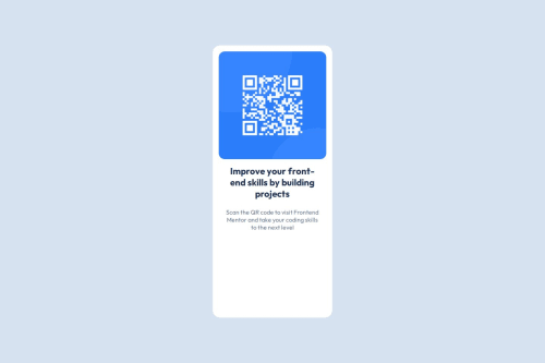
Great job so far. Your html is clean and simple, and your css is well-organized and clear. You were able to center the card on the page and connect to Google fonts. The next step is to work on the responsiveness.
At desktop (1440px) the container stretches down too far. This is because you have a height of 75vh no matter what the device screen size is. In this case it would be better to set the container height to "auto". Then it will adjust properly to different screen sizes.
When I try to view the page on my iPhone it is too narrow to read. This is where responsiveness comes in. Add a media query to the css to fix this. This article explains all about it. In this case it would look something like:
@media (max-width: 400px) { .card { width: 82vw; } }CSS will apply this style only if your device's viewport width is equal to or narrower than 400px; after that it reverts back to 22vw.
Hope this helps.
Marked as helpful - @Gummi-D
Did you account for the different line-heights in the design spec?
Join our Discord community
Join thousands of Frontend Mentor community members taking the challenges, sharing resources, helping each other, and chatting about all things front-end!
Join our Discord