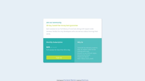
Not Found
Not Found
Not Found
Not Found
Not Found
Not Found
Not Found
Not Found
Not Found
Not Found
Not Found
Not Found
Not Found
Not Found
Not Found
Not Found
Not Found
Not Found
Not Found
Not Found

Submitted

Flex and grid display

@paminus-kingori

Desktop design screenshot for the Single price grid component coding challenge

This is a solution for...

  • HTML
  • CSS
1newbie
View challenge

Design comparison


SolutionDesign

Solution retrospective


Feedback will be highly appreciated.

Community feedback

Shashi Lo 1,345

@shashilo

Posted

Hey Paminus. Great job getting this done. It looks good, but I did find some things you can improve on:

  • Overall width should be larger.
  • Font-size and text color needs a closer look.
  • Overall container box-shadow is also off. It's too harsh right now and should be more subtle and spread out.
  • The submit button's box-shadow are incorrect as well.
  • Check the Why Us content. It seems too big and needs more padding.
  • Check your margins on the mobile screen. Some elements need more spacing.
0

Please log in to post a comment

Log in with GitHub
Discord logo

Join our Discord community

Join thousands of Frontend Mentor community members taking the challenges, sharing resources, helping each other, and chatting about all things front-end!

Join our Discord