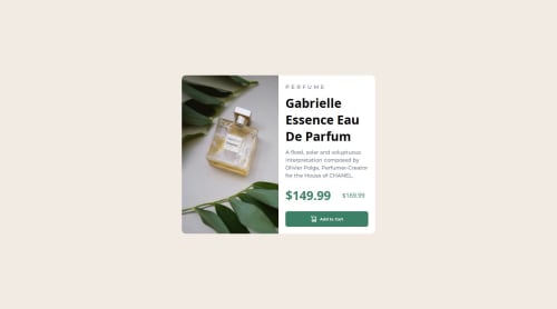
Submitted about 1 year agoA solution to the Product preview card component challenge
flex and media queries

@sridhar0612
Solution retrospective
What are you most proud of, and what would you do differently next time?
helps to learn media queries
What challenges did you encounter, and how did you overcome them?media queries and layout
What specific areas of your project would you like help with?reponsiveness
Code
Please log in to post a comment
Log in with GitHubCommunity feedback
- P@danielmrz-dev
Hello @sridhar0612!
Your project looks great!
I have a suggestion about your code that might interest you:
📌 You can use the
<picture>tag when you have different versions of the same image.Using the
<picture>tag will help load the correct image to the user's device, saving bandwidth and improving performance.Example:
<picture>
    <source media="(min-width: 768px)" srcset="{desktop image path here}">
    <img src="{mobile image path here}" alt="{alternative text here}">
</picture>
I hope this helps!
Other than that, excellent work!
- @karthickg24
Congratulations on completing this project. Please check whether you are using same family and color as in the design.


Join our Discord community
Join thousands of Frontend Mentor community members taking the challenges, sharing resources, helping each other, and chatting about all things front-end!
Join our Discord