Flex layout for responsive design

Solution retrospective
I think I still need to figure out responsiveness properly since my solution is not THAT responsive.
What specific areas of your project would you like help with?Responsiveness , I've always had an issue with this that makes me dread web dev
Please log in to post a comment
Log in with GitHubCommunity feedback
- P@Islandstone89
HTML:
-
Every webpage needs a
<main>that wraps all of the content, except for<header>andfooter>. This is vital for accessibility, as it helps screen readers identify a page's "main" content. Change<section class="bg-component">to<main class="bg-component">. -
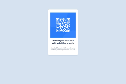
The QR code is important content, and should be placed in the HTML, not as a background image. Since it has meaning, it must have proper alt text. Write something short and descriptive, without including words like "image" or "photo". Screen readers start announcing images with "image", so an alt text of "image of qr code" would be read like this: "image, image of qr code". The alt text must also say where it leads(the frontendmentor website). A good alt text would be "QR code leading to the Frontend Mentor website." I would also give it a class:
<img src="images/image-qr-code.png" class="qr-image" alt="QR code leading to the Frontend Mentor website.">
CSS:
-
Including a CSS Reset at the top is good practice.
-
Remember to specify a fallback font:
font-family: 'Outfit',sans-serif; -
I recommend adding a bit of
padding, for example16px, on thebody, to ensure the card doesn't touch the edges on small screens. -
Remove all styles on the
<main>. -
To center the card horizontally and vertically, I would use Flexbox on the body:
display: flex; flex-direction: column; justify-content: center; align-items: center; min-height: 100svh;-
Remove all widths and heights in
px. We rarely want to give a component a fixed size, as we need it to grow and shrink according to the screen size. -
We do want to limit the width of the card, so it doesn't get too wide on larger screens. To solve this issue, give the card a
max-widthof around20rem. -
font-sizemust never be in px. This is a big accessibility issue, as it prevents the font size from scaling with the user's default setting in the browser. Use rem instead. -
Since all of the text should be centered, you only need to set
text-align: centeron the body, and remove it elsewhere. The children will inherit the value. -
Paragraphs have a default value of
font-weight: 400, so there is no need to declare it. -
On the image, add
display: block,height: autoandmax-width: 100%- the max-width prevents it from overflowing its container. Without this, an image would overflow if its intrinsic size is wider than the container.max-width: 100%makes the image shrink to fit inside its container. -
Remove
flex-wrap: wrap, it is not needed. -
I would increase the
paddingandborder-radiuson the card to16px. -
Add
border-radius: 16pxon the image.
Marked as helpful -
- @i000o
I was advised to apply
display: flex;to thebodytag rather than the card itself. This helps the whole thing to flex down as you downsize the window without you having to add lots of unnecessary media queries which is what I did. Have a look at my solution and see how they compare. Responsiveness is scary but I think sometimes we overcomplicate it. Good luck!


Join our Discord community
Join thousands of Frontend Mentor community members taking the challenges, sharing resources, helping each other, and chatting about all things front-end!
Join our Discord