Not Found
Not Found
Not Found
Not Found
Not Found
Not Found
Not Found
Not Found
Not Found
Not Found
Not Found
Not Found
Not Found
Not Found
Not Found
Not Found
Not Found
Not Found
Not Found
Not Found

Submitted

Flexbox

beshoy 80

@beshoyyatef


Design comparison


SolutionDesign

Solution retrospective


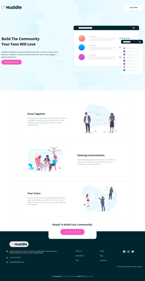
hello everyone! this is my attempts of the template any feedback will be nice.. and if somebody knows how to increase SEO will be nice if you share it with me :)

Community feedback

Divine Obeten 2,435

@Deevyn9

Posted

Hi Bashoy,

Great Project, exciting to view. Although the margins on the hero page would needto be tweaked, everything is great, placement and layout, all excellent.

About improving seo, i found a link: https://www.websolutions.com/blog/10-google-hacks-to-improve-your-search-rank-for-free/ Hopefully it works for you.

Happy coding

Marked as helpful

2

beshoy 80

@beshoyyatef

Posted

@Deevyn9 thank you for your feedback and the article helped me to understand how to increase seo so thank you again :)

1
Divine Obeten 2,435

@Deevyn9

Posted

@beshoyyatef you’re welcome

0

@pikapikamart

Posted

Hey, nice work on this one. For the layout, on desktop view maybe adjusting the padding would be nice. If you look at the design, there is a fixed padding on the left and right side for each of the landmark elements, you can follow that to improve the ui. Some text as well got smaller after the hero section. For mobile state, I think it looks fine.

Here are some suggestions besides Divine Obeten feedback:

  • For the the site-logo-link, always remember to add either aria-label or an sr-only text inside it so that a user will know where the link would take them. You do this when there are no text-content inside the anchor. For this one, you can use like aria-label="homepage" on the a tag.
  • Always add the site name on the site's logo because that logo is one of the meaningful element on the site. Use alt="Huddle".
  • You can include the site-logo-link inside the nav if you want since it is being treated as link. But to be honest, I think you can just replace the nav by just a div since the link/s inside is not much, the nav would be much better on the links inside the footer tag.
  • Don't use height: 100vh on an element, this will make the element's height not consistent. Try going into dev tools at the bottom, you will notice that the hero section's height got small because of this property. Instead, use min-height: 100vh so that the container will respond properly.
  • I would change those section tags into just div because section alone is not that informative as a landmark element. By navigating using screen-reader, when it traverses the section tag, it won't announce it as a landmark even if you are traversing it as a landmark compared to like main, header and footer. div would be fine^^
  • Don't use br tag to cut the text, you can just add max-width on the text-element.
  • For the hero-image, you can add an aria-hidden="true" attribute on the img tag so that it will be completely hidden for other assistive tech. You can this as well on the svg's that are used across the page.

FOOTER

  • On the logo, you are trying to make it white right, adding background-color to img won't work. What you can do is that add the svg's code itself on your html, then change the fill property of either the svg or path I think to the color that you want and this will changed the svg's color.

  • Same goes again for the logo-link, use a text that describes where the link would take and use the site's name as the alt value.

  • Those 6 links are all related to one another and using a single ul to wrap them would be better and also, you can wrap that ul tag by nav tag since those are the site's navigational links.

  • Those social media links could be wrapped inside a ul tag as well since they are list of links.

  • Since you are adding a hover state for the social media, you are implying that those are interactive, hence wrapping those inside their own a tag would be better, added as well the sr-only text or aria-label pointing on where it would take the user.

  • Lastly, if you pushed an update to your solution, clicking again the generate report so that it will clear up some issue if you fixed it.

Aside from those, great job again on this one.

Marked as helpful

1

beshoy 80

@beshoyyatef

Posted

@pikapikamart Thank you for your feedback it really helped me a lot. thanks for your time again!

1

Please log in to post a comment

Log in with GitHub
Discord logo

Join our Discord community

Join thousands of Frontend Mentor community members taking the challenges, sharing resources, helping each other, and chatting about all things front-end!

Join our Discord