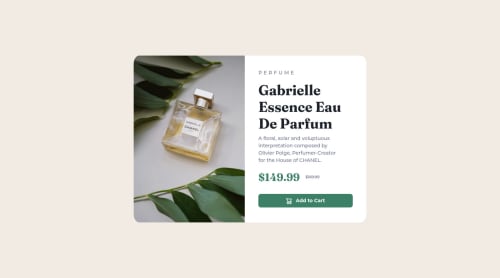
Submitted almost 3 years agoA solution to the Product preview card component challenge
Flexbox and boostrap

@Nondaba
Solution retrospective
I encountered difficulty while I was applying media query for phone screen size, I did not know how to change the desktop design image to a mobile design image. Did I use the correct HTML mark up? Are my styles for elements suitable for phone screen size?
Code
Loading...
Please log in to post a comment
Log in with GitHubCommunity feedback
No feedback yet. Be the first to give feedback on Real uNondaba's solution.
Join our Discord community
Join thousands of Frontend Mentor community members taking the challenges, sharing resources, helping each other, and chatting about all things front-end!
Join our Discord