Submitted over 1 year agoA solution to the Blog preview card challenge
flexbox and containers

@matt2282
Solution retrospective
What are you most proud of, and what would you do differently next time?
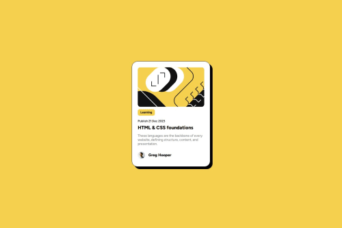
I enjoyed adding a shadow the background of my container. I would put my style in a style.css file instead of the html file. Using the space-between flexbox option makes the most sense for pages like this because the content at the bottom and top need to be equally spaced from the edges.
What challenges did you encounter, and how did you overcome them?I was trying to make the yellow leaning text box only as big as the text but it was very large. It turned out to be an issue with default margins of the h1 header.
What specific areas of your project would you like help with?Is my code deviating from any best practices?
Code
Loading...
Please log in to post a comment
Log in with GitHubCommunity feedback
No feedback yet. Be the first to give feedback on matt2282's solution.
Join our Discord community
Join thousands of Frontend Mentor community members taking the challenges, sharing resources, helping each other, and chatting about all things front-end!
Join our Discord