flexbox and media queries

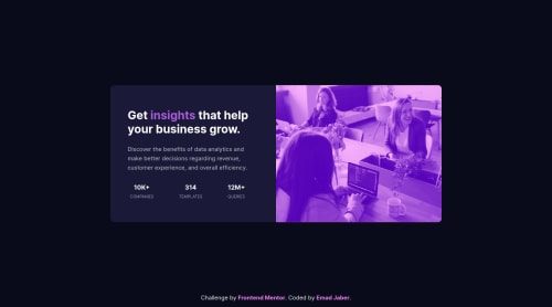
Solution retrospective
Hello Everyone, I really need your comments and advice.
Please log in to post a comment
Log in with GitHubCommunity feedback
- @MojtabaMosavi
Hi!, looks nice and responds well. A small improvement that you can make is to make the fonts a litle bigger on desktop view because is increases the readability.
Keep coding :)
Marked as helpful - @chysomm62
Great work. Try putting your card in a wrapper and using display flex, just changing flex-direction in mobile or desktop.
- @grace-snow
I'm afraid this is all unreadable for me because it's so small
Good html structure though ☺
- @rohits673
Hi, I checked your site its looks accurate on desktop version, still you can improve it for medium sized devices and mobile as on both of it looks really small due to too much space around also you should avoid fixed width of
.cardcomponents also as you are using flexbox you can use it in.containerto centralize your card instead of usingtransform:translate(-50%,-50%);you can use responsive unit like vh for deciding height for the .card divs. For more clarification please check my solution an please let me know if there is any improvement i can do there. Thanks!


Join our Discord community
Join thousands of Frontend Mentor community members taking the challenges, sharing resources, helping each other, and chatting about all things front-end!
Join our Discord