Skip to content
  • Unlock Pro
  • Log in with GitHub
Solution
Submitted over 2 years ago

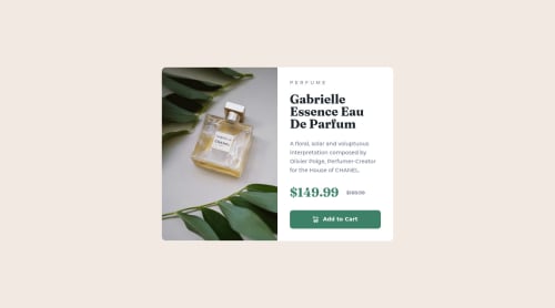
Flexbox and responsive images with picture element

Riley•260
@rileydevdzn
A solution to the Product preview card component challenge
View live sitePreview (opens in new tab)View codeCode (opens in new tab)

Solution retrospective


Hey guys!

Back at it with responsive images, this time using the <picture> element. And exploring more of Flexbox's capabilities with the goal of minimizing the number of media queries I needed.

Had a couple of responsive design questions, thoughts/suggestions/feedback is welcome!

  • I used percentages for margin between the text elements since the spacing varies but the font sizes don't change in this challenge. row-gap (and gap in general) for Flexbox and Grid are great when the spacing is identical, but I couldn't find a way to implement different gaps without adding a bunch more elements and styling. Using percentages required an additional media query in order to match the design. Does anyone know of a better approach for this?
  • I've been using absolute (px) units for border-radius but would be more inclined to use em if I used relative units. Thoughts on em vs. percentage vs. viewport units for border-radius?

Thanks!

Code
Select a file

Please log in to post a comment

Log in with GitHub

Community feedback

  • Aghla Abdo•340
    @AghlaAbdo
    Posted over 2 years ago

    That's awesome, you really did a great job

    I cannot differentiate between you solution and the origin image. If you could just make some small changes to the font size and match it with origin image so you can't see the small dance of the text when you scroll between your solution and the design😅.

    There is nothing else to say. Good Luck for your coding Journey 😊

  • James Dennis•220
    @emarketguy27
    Posted over 2 years ago

    Hi Riley, Great job - the solution is pretty spot-on.

    As to your question about implementing different gaps to minimize styling... I have been experimenting with 'clamp' settings as 'global styles' declared under .root

    I'm finding that using 'clamp' for font-sizes and image sizes allows for a nice responsive scaling of the relevant elements without the need to add extra font size / image size styling in media queries.

    Best regards.

Join our Discord community

Join thousands of Frontend Mentor community members taking the challenges, sharing resources, helping each other, and chatting about all things front-end!

Join our Discord
Frontend Mentor logo

Stay up to datewith new challenges, featured solutions, selected articles, and our latest news

Frontend Mentor

  • Unlock Pro
  • Contact us
  • FAQs
  • Become a partner

Explore

  • Learning paths
  • Challenges
  • Solutions
  • Articles

Community

  • Discord
  • Guidelines

For companies

  • Hire developers
  • Train developers
© Frontend Mentor 2019 - 2025
  • Terms
  • Cookie Policy
  • Privacy Policy
  • License

Oops! 😬

You need to be logged in before you can do that.

Log in with GitHub

Oops! 😬

You need to be logged in before you can do that.

Log in with GitHub

How does the accessibility report work?

When a solution is submitted, we use axe-core to run an automated audit of your code.

This picks out common accessibility issues like not using semantic HTML and not having proper heading hierarchies, among others.

This automated audit is fairly surface level, so we encourage to you review the project and code in more detail with accessibility best practices in mind.

How does the CSS report work?

When a solution is submitted, we use stylelint to run an automated check on the CSS code.

We've added some of our own linting rules based on recommended best practices. These rules are prefixed with frontend-mentor/ which you'll see at the top of each issue in the report.

The report will audit all CSS, SCSS and Less files in your repository.

How does the HTML validation report work?

When a solution is submitted, we use html-validate to run an automated check on the HTML code.

The report picks out common HTML issues such as not using headings within section elements and incorrect nesting of elements, among others.

Note that the report can pick up “invalid” attributes, which some frameworks automatically add to the HTML. These attributes are crucial for how the frameworks function, although they’re technically not valid HTML. As such, some projects can show up with many HTML validation errors, which are benign and are a necessary part of the framework.

How does the JavaScript validation report work?

When a solution is submitted, we use eslint to run an automated check on the JavaScript code.

The report picks out common JavaScript issues such as not using semicolons and using var instead of let or const, among others.

The report will audit all JS and JSX files in your repository. We currently do not support Typescript or other frontend frameworks.

Oops! 😬

You need to be logged in before you can do that.

Log in with GitHub

Oops! 😬

You need to be logged in before you can do that.

Log in with GitHub